Unlock a world of possibilities! Login now and discover the exclusive benefits awaiting you.
- Qlik Community
- :
- Forums
- :
- Analytics
- :
- App Development
- :
- Re: Why has the scroll bar style changed?
- Subscribe to RSS Feed
- Mark Topic as New
- Mark Topic as Read
- Float this Topic for Current User
- Bookmark
- Subscribe
- Mute
- Printer Friendly Page
- Mark as New
- Bookmark
- Subscribe
- Mute
- Subscribe to RSS Feed
- Permalink
- Report Inappropriate Content
Why has the scroll bar style changed?
It looks like on Qlik SaaS and client-managed February 2024 the style of the scroll bar has changed and is now no longer styled - why has this changed?
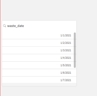
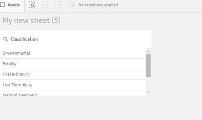
Existing:
New:
It's frustrating when things change like this and aren't clearly documented in release notes.
Will they be coming back?
- « Previous Replies
-
- 1
- 2
- Next Replies »
- Mark as New
- Bookmark
- Subscribe
- Mute
- Subscribe to RSS Feed
- Permalink
- Report Inappropriate Content
You have discovered one of the joys of using Sense on the Cloud. I have a book which teaches building applications in Sense and I am forever updating all the screenshots for the various changes. Most recently this has been to update Qlik's logo everywhere! The weight of the FX buttons and some of the other buttons has also been tweaked recently.
The fact that the new scroll bars have made it into a Client Managed release I would guess that they will be staying. Sometimes Cloud changes appear and then disappear again, but usually if something changes it sticks.
Steve
- Mark as New
- Bookmark
- Subscribe
- Mute
- Subscribe to RSS Feed
- Permalink
- Report Inappropriate Content
Hi @lachlanwcast,
changes like this are usually due to usability choices. Is the new scrollbar causing you any problem?
If a post helps to resolve your issue, please accept it as a Solution.
- Mark as New
- Bookmark
- Subscribe
- Mute
- Subscribe to RSS Feed
- Permalink
- Report Inappropriate Content
Hi Daniele,
It's more from a UX perspective - some objects use the original 'webkit' scrollbar, other objects use the 'default' scrollbar, I'd argue they should all match and be one or the other.
From a usability perspective, items that can be quite narrow (i.e filters) original behavior was to hide the scrollbar until the user hovers - now the scrollbar is there all the time, takes up more room and just doesn't look as 'modern' as the original scrollbar
- Mark as New
- Bookmark
- Subscribe
- Mute
- Subscribe to RSS Feed
- Permalink
- Report Inappropriate Content
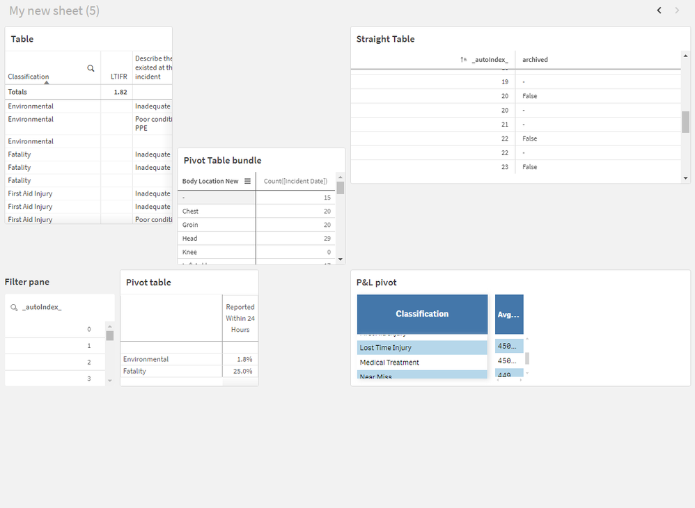
Here's an example. 3 distinct types of scrollbars
The old style webkit bar in the Table and Pivot table (that hides when you're not focused/hovering)
The unstyled scrollbar in the Filter pane, straight table and pivot table from the visualisation bundle
and another kind of semi-styled scrollbar in the P&L pivot
Surely using a single concise scroll bar style would be more effective visually? Either that or allow a user to select the scroll bar type
The filter pane has this CSS styled against by default which brings it back to the old 'unstyled' type
- Mark as New
- Bookmark
- Subscribe
- Mute
- Subscribe to RSS Feed
- Permalink
- Report Inappropriate Content
Thanks Steve - I could imagine it being painful.....
This particular instance seems like an oversight, if they wanted to put an alternative scroll bar in that resonated more, perhaps because people didn't realize they could scroll down in a list box, I would have thought they would implement it on that particular object, and also style it in a way to make it look like the others, perhaps just not hiding it when not on focus/hover.
We'll see!
- Mark as New
- Bookmark
- Subscribe
- Mute
- Subscribe to RSS Feed
- Permalink
- Report Inappropriate Content
The original scrollbar is a hangover from the very strict touch device first UX philosophy which was used when Sense was designed. The permanent scrollbar is much better in most cases when you have a decent sized screen.
The thing that gets me with the "invisible until you over it" scrollbar is that when you have a table with only a few rows, but there is a lot of vertical space in the object, the scrollbar partially obscures the last row of data, rather than being at the bottom of the object, where you might expect it to be. Even now, after nearly a decade, I still go to the bottom of the object rather than the bottom of the data first.
BTW, you forgot the mini-chart scroll in your list of possible scroll options!
Steve
- Mark as New
- Bookmark
- Subscribe
- Mute
- Subscribe to RSS Feed
- Permalink
- Report Inappropriate Content
@lachlanwcast Did you get a solution on this as I am also facing similar issue.
- Mark as New
- Bookmark
- Subscribe
- Mute
- Subscribe to RSS Feed
- Permalink
- Report Inappropriate Content
I added this css to a custom theme to imitate the previous scroolbar. It doesn't behave exactly like it used to, but for me it was good enough.
.ListBox-styledScrollbars {
        scrollbar-color: unset!important;
}
.ListBox-styledScrollbars {
	overflow-y:hidden!important;
}
.ListBox-styledScrollbars:hover {
	overflow-y:auto!important;
}
There might be other better ways, but this is what I came up with when experimenting. I have not tested it in all possible browers and resolutions and whatever. I'm not giving any guarantees that it will work for you in every situation.
- Mark as New
- Bookmark
- Subscribe
- Mute
- Subscribe to RSS Feed
- Permalink
- Report Inappropriate Content
@henrikalmen Thanks its working.
- « Previous Replies
-
- 1
- 2
- Next Replies »


