Unlock a world of possibilities! Login now and discover the exclusive benefits awaiting you.
- Qlik Community
- :
- Forums
- :
- Analytics & AI
- :
- Products & Topics
- :
- App Development
- :
- Write script for chart that groups multiple catego...
- Subscribe to RSS Feed
- Mark Topic as New
- Mark Topic as Read
- Float this Topic for Current User
- Bookmark
- Subscribe
- Mute
- Printer Friendly Page
- Mark as New
- Bookmark
- Subscribe
- Mute
- Subscribe to RSS Feed
- Permalink
- Report Inappropriate Content
Write script for chart that groups multiple categories together
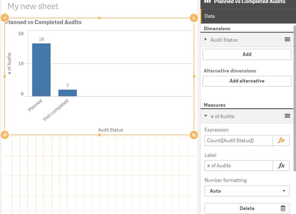
I have a spreadsheet for our audits that has a column titled “Audit Status”. The drop-down for that column is only:
- Planned
- Visit Completed
- Draft Report Issued
- Responses Due
- Final Report
I want to create a chart that shows how many audits we’ve done vs how many are still left to be done. The audits completed would be “Visit Completed”, “Draft Report Issued”, “Responses Due”, and “Final Report”. The audits that are still left to be done are “Planned” or also rows that have a blank response in this field. I’m doing a bar chart and I have Audit Status as the dimension and Count([Audit Status]) as the measure and it gives me this chart. How can I rewrite the measure so that it groups completed audit categories together (Visit Completed/Draft Report Issued/Responses Due/Final Report) and the audits left to be done (Planned/null) together?
- Mark as New
- Bookmark
- Subscribe
- Mute
- Subscribe to RSS Feed
- Permalink
- Report Inappropriate Content
Hi Dave,
on chart level you can add this calculated dimension:
=If(Match([Audit Status], 'Visit Completed', 'Draft Report Issued', 'Responses Due', 'Final Report'), 'Completed', 'To Do')
and leave your measure as it is.
However I would recommend to precalculate this in script and then use that field as a regular dimensions in your chart, because calculated dimensions tend to be performance heave on larger datasets (not sure about the amount of data you're working with).
Hope this helps.
Juraj