Unlock a world of possibilities! Login now and discover the exclusive benefits awaiting you.
- Qlik Community
- :
- Forums
- :
- Groups
- :
- Industry and Topics
- :
- Healthcare
- :
- Visualizing Blood Pressure
- Subscribe to RSS Feed
- Mark Topic as New
- Mark Topic as Read
- Float this Topic for Current User
- Bookmark
- Subscribe
- Mute
- Printer Friendly Page
- Feature this Topic
- Mark as New
- Bookmark
- Subscribe
- Mute
- Subscribe to RSS Feed
- Permalink
- Report Inappropriate Content
Visualizing Blood Pressure
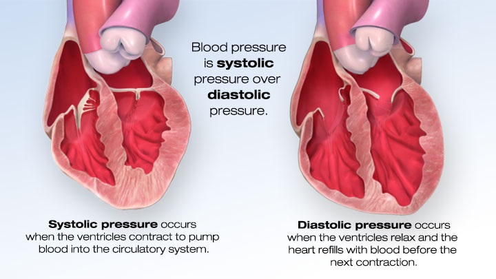
I was recently asked to produce a rounding report for physicians. Easy enough right? Slap some vitals on a page, toss in some lab results and the medication administration record and voila … you have a rounding report. But that was the old me. The new me is inspired to put as much effort into visualizing the data as I’ve been putting into finding it, extracting it, transforming it, loading it and modeling it. The problem is I’m a 0’s and 1’s kind of guy … what do I know about clinical data or how physicians need to see it or the decisions it may help them make … or worse what decisions won’t they make if I present the data in a way that is misleading. In this post I’m going to focus simply on the presentation of the blood pressure data. In future posts I’ll move on but this seems to be the perfect data type for how me to demonstrate how to add value to something through the art of data visualization. The first point I need to get across is that your visualizations won’t be successful unless you truly understand the data you are presenting.
Your visualizations won't be successful unless you truly understand the data you are presenting.
I’ve just begun my journey through Randy Krum’s book “Cool Infographics.” I can tell you that even he would smile at the American Heart Associations site I found to research bloodpressure. They take boring blood pressure information and present it with static, interactive and video based infographics. Like a learning tri-fecta for me. Helps me understand the data I’m dealing with, helps me clearly understand the points Randy makes and provides me with a catchy opening graphic for this post. Clicking on the image will take you to their website so you can see why I think it’s so cool, plus you’ll have the chance to learn everything you wanted to know about blood pressure, it’s effect on us and why it’s so vital to portray this vital (pun intended) in the best way that we possibly can.
One of the wonderful facets of QlikView is that it allows you to present raw data tables so that you can verify the data when there are questions. “What you don’t believe my numbers … here is the raw data to back them up.” That’s huge for sure.
Click here to read the rest of my post at QlikDork.com
I've attached a simple QVW file that walks you through the several iterations of charts that I used for my post. I can't wait to see the imagination of others at displaying simple numbers reflecting the millimeters of mercury in a way that creates #DataDiscovery.
- Mark as New
- Bookmark
- Subscribe
- Mute
- Subscribe to RSS Feed
- Permalink
- Report Inappropriate Content
Really cool and valuable post, Dalton! Thanks for sharing.