Unlock a world of possibilities! Login now and discover the exclusive benefits awaiting you.
- Qlik Community
- :
- Forums
- :
- Groups
- :
- Industry and Topics
- :
- Healthcare
- :
- Re: Visualizing Paths and Flow with Sankey Diagram...
- Subscribe to RSS Feed
- Mark Topic as New
- Mark Topic as Read
- Float this Topic for Current User
- Bookmark
- Subscribe
- Mute
- Printer Friendly Page
- Feature this Topic
- Mark as New
- Bookmark
- Subscribe
- Mute
- Subscribe to RSS Feed
- Permalink
- Report Inappropriate Content
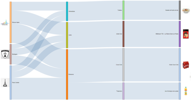
Visualizing Paths and Flow with Sankey Diagrams
Sankey diagrams are a specific type of flow diagram, in which the width of the paths represent some quantity. These multidimensional visualizations help you to see flow and discover category relationships with a different perspective. If you were to ask me what my favorite visualization was, I'd most likely say: "The Sankey!"
Sankey diagrams show metric flows and category relationships. You can use a Sankey diagram to visualize relationship density and trends.
Use Cases for the Sankey Diagram
Use a Sankey diagram to visualize activity patterns such as:
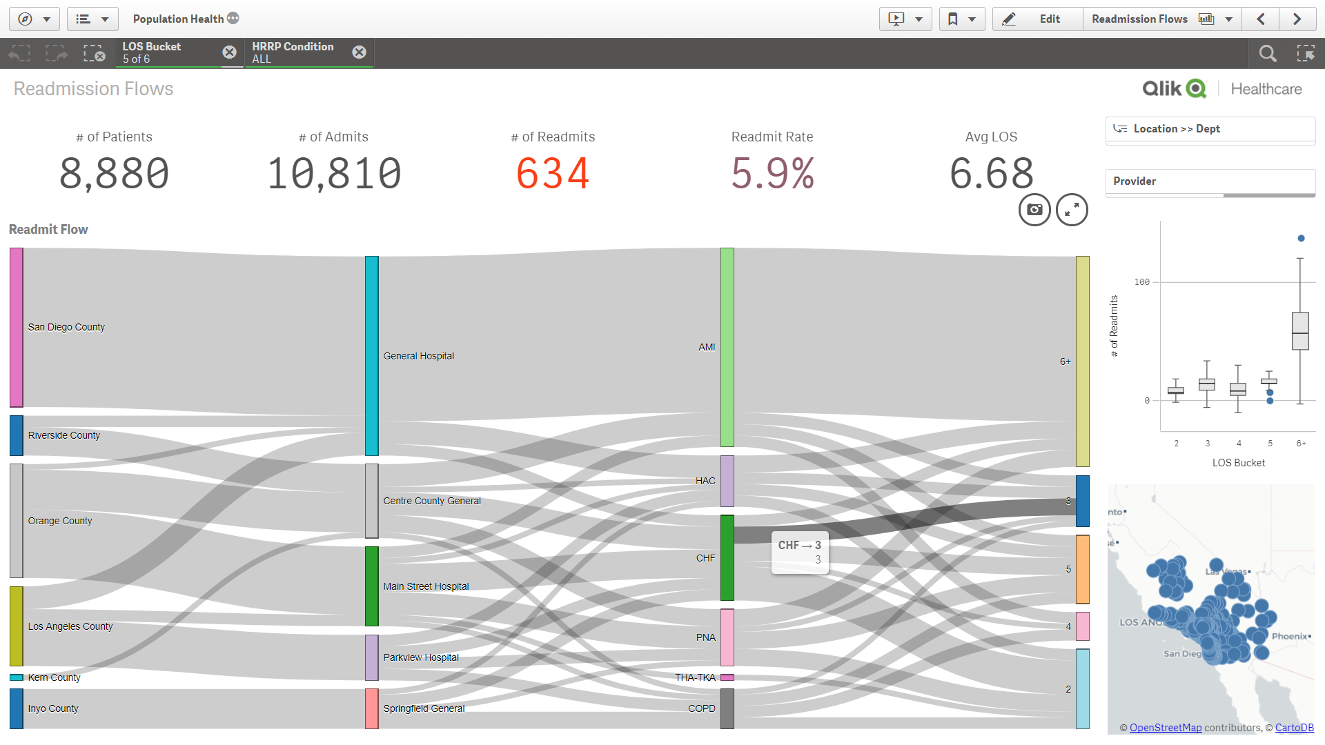
- Flow: Patient admission and visit flow through your health system - where are patients coming from and where do they have encounters without our facilities and offices?
- Flow: Patient web activity on your patient portal - where are patients looking for information and where do they end up?
- Flow: Longitudinal risk scores for multiple visits - how do risk scores change with subsequent visits?
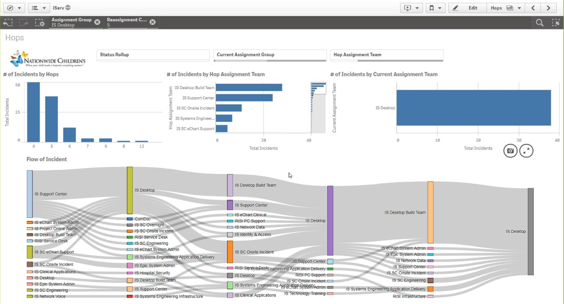
- Flow: ServiceNow ticket handoffs and SLA compliance (showcased by Nationwide Children's in Nov 2017) - which requests or departments pass tickets back and forth perhaps too much?
- Flow and Relationships: Care Pathways showing outcomes metric by various treatments or protocols - do patients receiving X have better outcomes than patients on Y?
- Relationships: readmissions by a variety of dimensions like county, hospital, condition, complexity, comorbidities, outcomes
- Relationships: Adherence by a variety of demographic and SDoH dimensions like sex, age, race, ethnicity, smoking status, language, support network, community, etc.
- What else have you seen or envision to be useful with a sankey? Please leave a comment here.
Data Requirements
To build a Sankey diagram, you need to have data that includes source and target categories (dimensions) and a metric that you are tracking between them. Luckily, with the Sankey diagrams, these can be completely different types of dimensions and hierarchies, or they can be source and (multiple) target(s) to visualize paths.
Think about it like this: you have one metric/measure of interest (like volume) and multiple dimensions to look at. In contrast to a scatter plot where you have one dimension and multiple metrics/measures.
How to Build/Download a Sankey Diagram
Qlik Sense
- Sankey Diagram for Qlik Sense - http://branch.qlik.com/#!/project/568aa0b06ed0f0f47a89d7f2
- Colorable Sankey - http://branch.qlik.com/#!/project/59f895c77b3744420b107829
QlikView
- QlikView Sankey Improved - http://branch.qlik.com/#!/project/57fce146e41f9c61570e6521
Examples

- « Previous Replies
-
- 1
- 2
- Next Replies »
- Mark as New
- Bookmark
- Subscribe
- Mute
- Subscribe to RSS Feed
- Permalink
- Report Inappropriate Content
I couldn't find how the data has to be structured. Other Sankey diagrams often have an array structure where each index represents objects and the last index represents a measure. Like this: [Germany, USA, 2999]
Could someone tell me the necessary data structure for this sankey extension? Why are there two dimensions?
- Mark as New
- Bookmark
- Subscribe
- Mute
- Subscribe to RSS Feed
- Permalink
- Report Inappropriate Content
Hello @joe_warbington ,
I found this example very interesting and would like to look how it works.
Hovever the links in section: How to Build/Download a Sankey Diagram are no longer valid for me.
Is it possible to updated them, or recommend how I could open and play this application ?
Best Regards,
Greg
- « Previous Replies
-
- 1
- 2
- Next Replies »