Unlock a world of possibilities! Login now and discover the exclusive benefits awaiting you.
- Qlik Community
- :
- Forums
- :
- Analytics
- :
- New to Qlik Analytics
- :
- Re: Alternative measures in scatter plot
- Subscribe to RSS Feed
- Mark Topic as New
- Mark Topic as Read
- Float this Topic for Current User
- Bookmark
- Subscribe
- Mute
- Printer Friendly Page
- Mark as New
- Bookmark
- Subscribe
- Mute
- Subscribe to RSS Feed
- Permalink
- Report Inappropriate Content
Alternative measures in scatter plot
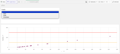
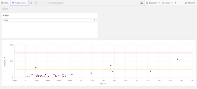
I am using a scatterplot.
I want to change only the x-axis with an alternate measure, is there any way?
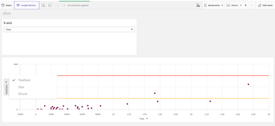
(Because the X-axis and Y-axis change in the same way)
I want to show only "TotalSales" on y-axis.(the last pictures)
Thank you.
Accepted Solutions
- Mark as New
- Bookmark
- Subscribe
- Mute
- Subscribe to RSS Feed
- Permalink
- Report Inappropriate Content
Hi Louise
So by default an additional alternative dimension will be selectable in both the X and Y Axis as you have discovered. To get around this (without using an extension) you could do the following:
1. Create two scatterplots, with the same Y Dimension and the desired different X Dimensions.
2. Save them as master visualisations.
3. Create a grouped container and add the master visualisations into them.
This should produce the desired end user requirement (example attached) and won't take up any more unecessary space on your sheets.
Hope this helps. 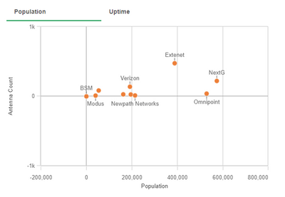
- Mark as New
- Bookmark
- Subscribe
- Mute
- Subscribe to RSS Feed
- Permalink
- Report Inappropriate Content
Thank you so much.
You mean, I can use the container to change the x axis, right.
Would it be difficult to vary the x-axis with alternate measures?
If it's possible, I wanna use filter panel to change only x axis...!
- Mark as New
- Bookmark
- Subscribe
- Mute
- Subscribe to RSS Feed
- Permalink
- Report Inappropriate Content
Yes, what you are essentially doing is creating two seperate scatter plots and using the grouped container labels (in my example Population and Uptime) as the X Axis dimension selector. The end user does not need to know that there are two scatterplots in play as it give you the same effect you are asking for. It's a bit inefficient but it works. There's probably smarter ways to do it but if it does the job....
Stu
- Mark as New
- Bookmark
- Subscribe
- Mute
- Subscribe to RSS Feed
- Permalink
- Report Inappropriate Content
Thats a good way to do it, to add another way to do it is to use a button and variable in the measure instead of actually using the measure and set an action to change the variable value on click of a button and set it to the measure value that you want to change it with.
I have been using it on my several sheets and it reduces the load time of the sheet and easier computation as well.
- Mark as New
- Bookmark
- Subscribe
- Mute
- Subscribe to RSS Feed
- Permalink
- Report Inappropriate Content
Thank you so much!
- Mark as New
- Bookmark
- Subscribe
- Mute
- Subscribe to RSS Feed
- Permalink
- Report Inappropriate Content
Thank you so much!
