Unlock a world of possibilities! Login now and discover the exclusive benefits awaiting you.
- Qlik Community
- :
- Forums
- :
- Analytics
- :
- New to Qlik Analytics
- :
- Re: Set Analysis Expression to Show Sum of Budget ...
- Subscribe to RSS Feed
- Mark Topic as New
- Mark Topic as Read
- Float this Topic for Current User
- Bookmark
- Subscribe
- Mute
- Printer Friendly Page
- Mark as New
- Bookmark
- Subscribe
- Mute
- Subscribe to RSS Feed
- Permalink
- Report Inappropriate Content
Budget vs Actuals - How to show budget values over Revenue for each Business Hierarchy

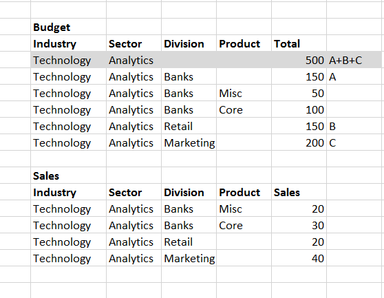
Above is an example of how Budget Table and Sales Fact table look like. I have joined both tables using a composite key that is based on the common fields in both tables.
What I would like to do is:
Display the Total budgets for each industry in a graph (for eg. the below graph should show the total budget amounts for all the 4 respective industries). Currently it is only showing bar values for revenue, i would like to add a marker at the top showing budget amounts, which are basically targets.
Challenge: How to keep the expression dynamic based on what selection user makes. As you can see above, the totals and individual values are all displayed as separate rows in the budget excel sheet.

- Mark as New
- Bookmark
- Subscribe
- Mute
- Subscribe to RSS Feed
- Permalink
- Report Inappropriate Content
How to keep the expression dynamic based on what selection user makes
That's the default behavior in Qlik Sense. So... I don't understand the problem. Can you post a small Qlik Sense app that shows the problem?
talk is cheap, supply exceeds demand
- Mark as New
- Bookmark
- Subscribe
- Mute
- Subscribe to RSS Feed
- Permalink
- Report Inappropriate Content
This is how the budget table looks like, and it linked to the main fact table using a composite key shown below:
The composite key is = Year + Industry + Sector + LoS + Competency

What I want :
In the above example - If I select Year "2017" and "EUMI" Industry, I should only see 1 row selected (highlighted in red). But currently it shows all the other rows which have these selections in common. Is there way to achieve this ?
- Mark as New
- Bookmark
- Subscribe
- Mute
- Subscribe to RSS Feed
- Permalink
- Report Inappropriate Content
Yes, select the value 2017|EMEU||| in the field Key. Because that is what you want to select. If you select 2017 and EMEU then you select all the records that have these values in those two fields. The result you get is correct, but that's not the selection you want to make. So make the selection you do want, which is 2017|EMEU||| in the field Key.
talk is cheap, supply exceeds demand
- Mark as New
- Bookmark
- Subscribe
- Mute
- Subscribe to RSS Feed
- Permalink
- Report Inappropriate Content
Correct, this is how the qlik associative model works, It will show all the matching possibilities. However, from the front end user perspective, since he just selects Industry and Fiscal Year to view sales numbers which come from the Main fact table. I don't know how get the results from this budget table by isolating all other possible values.
- Mark as New
- Bookmark
- Subscribe
- Mute
- Subscribe to RSS Feed
- Permalink
- Report Inappropriate Content
Hi,
first of all, why does your budget table has the aggregated measures mixed with detailed measures, i.e. , Total of Division=Banks and Total of Sector=Analytics? You'll have to filter it out, according with the dimension used in each Graph you generate. Only use them when your data has no information on lower level, like in the Divisions Retail and Marketing.
Sum(Total) does the summarisation for you, by definition. And not filtering data out, you won't need set analysis. As Mr gwassenaar pointed out, the dynamism you want is Sense's normal behavior
About the reason why budget value isn't showing up , we'll need more information about, like the joining rule, the expression you are using on your graph.
- Mark as New
- Bookmark
- Subscribe
- Mute
- Subscribe to RSS Feed
- Permalink
- Report Inappropriate Content
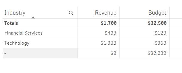
I have attached a sample data file, which contains budget and actuals data. And I have also attached a sample qvf file that has a combo chart and table trying to represent actual revenue and budget for the respective Industry, Sector, LOS, Competency breakdown. Currently the graph / table does not show the budget numbers correctly. I have linked the budget and fact table using a composite key of columns that are common in both table.
For eg. As per the sample file, The budget for "Financial Services" should be $1940, but the graph / table incorrectly shows a different value.
