Unlock a world of possibilities! Login now and discover the exclusive benefits awaiting you.
- Qlik Community
- :
- Forums
- :
- Analytics
- :
- New to Qlik Analytics
- :
- Re: Can we change the look and features of in-buil...
- Subscribe to RSS Feed
- Mark Topic as New
- Mark Topic as Read
- Float this Topic for Current User
- Bookmark
- Subscribe
- Mute
- Printer Friendly Page
- Mark as New
- Bookmark
- Subscribe
- Mute
- Subscribe to RSS Feed
- Permalink
- Report Inappropriate Content
Can we change the look and features of in-built charts in Sense....
Hi
I want to change some functionality of a combo chart in Qlik Sense.
I tried downloading the d3 visualiztion also, but my requirements are not met.
Please suggest.
Thanks,
Chetan
- Mark as New
- Bookmark
- Subscribe
- Mute
- Subscribe to RSS Feed
- Permalink
- Report Inappropriate Content
what change you want to do?
- Mark as New
- Bookmark
- Subscribe
- Mute
- Subscribe to RSS Feed
- Permalink
- Report Inappropriate Content
Its a little difficult to suggest something if you don't say what you need.
- Mark as New
- Bookmark
- Subscribe
- Mute
- Subscribe to RSS Feed
- Permalink
- Report Inappropriate Content
I want to change the colors of 2 measures manually using expression.
Example:
Dim1 : MonthYear
Measure1: Sum(Sales)
Measure2: Sum(Discount)
If want to give colors to measures of my own choice which are not present in the default color list.
For an instance--->
Sum(Sales) : Liight grey
Sum(Discount) : Lime Yellow
I could you Valuelist function, but it needs one more dimension. Unfortunately Combo chart has only dimension.
Please suggest.
- Mark as New
- Bookmark
- Subscribe
- Mute
- Subscribe to RSS Feed
- Permalink
- Report Inappropriate Content
If you are using either bar or line for both measures then you can use Bar chart or Line chart with valuelist()
- Mark as New
- Bookmark
- Subscribe
- Mute
- Subscribe to RSS Feed
- Permalink
- Report Inappropriate Content
I am using both the bar and line
Sum(Sales)--> Bar (Color 1)
Sum(Discount)---> Line(Color 2)
- Mark as New
- Bookmark
- Subscribe
- Mute
- Subscribe to RSS Feed
- Permalink
- Report Inappropriate Content
you can try Qlik Branch extension and change color in css file according to requirement
- Mark as New
- Bookmark
- Subscribe
- Mute
- Subscribe to RSS Feed
- Permalink
- Report Inappropriate Content
You could try one of these Qlik Branch projects.
![]() Highcharts-visualizationLibrary
Highcharts-visualizationLibrary
Qlik Community MVP
- Mark as New
- Bookmark
- Subscribe
- Mute
- Subscribe to RSS Feed
- Permalink
- Report Inappropriate Content
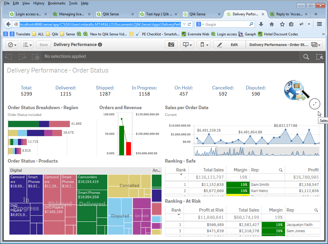
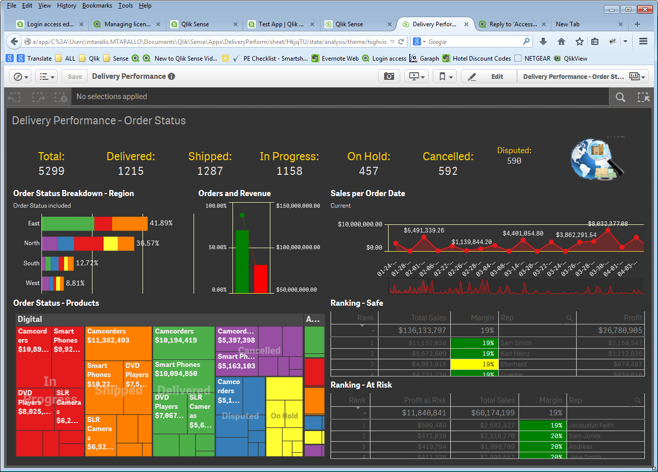
If you want to alter the look and feel of standard Qlik Sense objects you need to alter the json theme file feeding the css of sense.
The result may transform a page like this:
Into something like this:

Take a look at this forum thread for more details: Re: Access to CSS
Qlik Community MVP