Unlock a world of possibilities! Login now and discover the exclusive benefits awaiting you.
- Qlik Community
- :
- Forums
- :
- Analytics
- :
- New to Qlik Analytics
- :
- Combo plot colour by month
- Subscribe to RSS Feed
- Mark Topic as New
- Mark Topic as Read
- Float this Topic for Current User
- Bookmark
- Subscribe
- Mute
- Printer Friendly Page
- Mark as New
- Bookmark
- Subscribe
- Mute
- Subscribe to RSS Feed
- Permalink
- Report Inappropriate Content
Combo plot colour by month
Hi everyone,
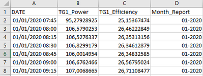
I'm struggling with something which seems quite easy for me. I have a dataset like this:
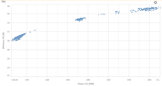
Where every quarter-hour I have a measure of power and the related measure of the efficiency of a piece of equipment (called TG1). In Qlik Sense using combo plot, I've realized a plot of efficiency (Y) against power (X).
The first day of each month I download the measure of power and efficiency of the previous month (eg: the 1st of February I download the data of January) and I update my Qlik Sense App. So the column "Month_Report" above is the month which the measures are referred to, and it's simply the year+month of DATE (could be created with an expression like this Date(DATE, 'MM-YYYY') )
Here we are at my question: how can I colour the point of my plot above according to "Month Report"? For example, I'd like all the point of January-2020 coloured green, the point of February-2020 of yellow, March-2020 of red and so on.
Lastly, I cannot do this colouring using explicit statement like this (even though they do work): = if(Month_Report='01-2020', Green(), if(Month_Report='02-2020',Yellow(), Red())). With "explicit" I mean using this expression requires me to modify it every month adding an if-statement at the end. Since in my app I've several combo plots which require this colouring, I can't update all their expressions.
Thank you for your help in this rather puzzling problem.
- Mark as New
- Bookmark
- Subscribe
- Mute
- Subscribe to RSS Feed
- Permalink
- Report Inappropriate Content
Hi,
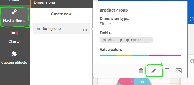
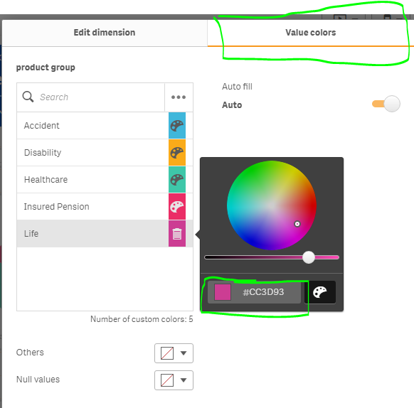
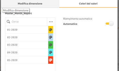
try to create master dimension/measure and set color there
see below screenshot
- Mark as New
- Bookmark
- Subscribe
- Mute
- Subscribe to RSS Feed
- Permalink
- Report Inappropriate Content
Hi,
thanks for your help. I'm trying to do what you suggested, but unfortunately, I'm not solving my problem.
I found that you could set the colours of a master item the way you did only for a dimension, not for a measure. I followed your suggestion and I've created the following measure master item:
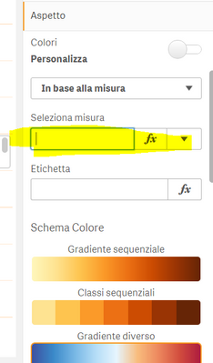
But now? In fact in my combo chart, I'm plotting efficiency against power, so I'm not using the Month_Report values. I was thinking to use this column only in the Aspect >> Colors and legend section, but here If I select "colouring by measure" or "colouring by expression" I cannot recall the above master item (sorry for Italian language, hope that could be understood):
In the box highlighted, at most, I can choose the "Month_Report" column (no master item) but I had already tried and this doesn't work.
- Mark as New
- Bookmark
- Subscribe
- Mute
- Subscribe to RSS Feed
- Permalink
- Report Inappropriate Content
Hi,
can you attach data and tell me what is your dimension and measure , I will try at my end
- Mark as New
- Bookmark
- Subscribe
- Mute
- Subscribe to RSS Feed
- Permalink
- Report Inappropriate Content
Hi,
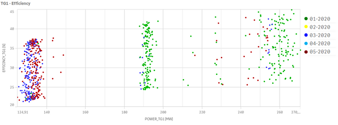
you can find an extract of my application attached. In there I also plotted what I expected to be my output:
So efficiency against power and each point coloured by the month to which the measure belongs (not each month has data). As you'll see, I coloured the chart using the explicit expression I'd like to replace in the future. The legend is simply an image I created in powerpoint and then pasted in the application, it'll be useful to substitute this as well with something more automatic.
Thanks!
- Mark as New
- Bookmark
- Subscribe
- Mute
- Subscribe to RSS Feed
- Permalink
- Report Inappropriate Content
Hi
I think you are used wrong chart( combo plot).
please try to use scatter chart then it working correct that you want
- Mark as New
- Bookmark
- Subscribe
- Mute
- Subscribe to RSS Feed
- Permalink
- Report Inappropriate Content
Hi,
thanks for your attempt, but I think you are missing my point. I'd like to colour my data of efficiency VS power depending on which month they refer to, without operating any aggregation on them. You can clearly see your output is different from the expected one: using scatter plot with "Month Report" as Dimension you aggregated the values monthly, so you have only one point per month which has as X the sum of the value of powers and as Y the average efficiency.
