Unlock a world of possibilities! Login now and discover the exclusive benefits awaiting you.
- Qlik Community
- :
- Forums
- :
- Analytics
- :
- New to Qlik Analytics
- :
- Creating a line chart using multiple dimensions (u...
- Subscribe to RSS Feed
- Mark Topic as New
- Mark Topic as Read
- Float this Topic for Current User
- Bookmark
- Subscribe
- Mute
- Printer Friendly Page
- Mark as New
- Bookmark
- Subscribe
- Mute
- Subscribe to RSS Feed
- Permalink
- Report Inappropriate Content
Creating a line chart using multiple dimensions (using date fields)
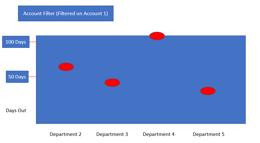
I am trying to create a line / bubble chart to create a line chart based on how long each department took to approve for a given account. The problem I am seeing is I cannot bring in 5 different department dates into my chart as it discombobulates the logic. I have attached my app and a .png of what I am trying to achieve. I hope it makes much more sense. If you have any thoughts on how to go about this, would love to hear you guys thinking.
Thanks!
- Mark as New
- Bookmark
- Subscribe
- Mute
- Subscribe to RSS Feed
- Permalink
- Report Inappropriate Content
I would change the underlying data model into a table that has a row per account and department with a third column for the number of days.
- Mark as New
- Bookmark
- Subscribe
- Mute
- Subscribe to RSS Feed
- Permalink
- Report Inappropriate Content
Hi,
You need to unpivoting the table, moving the coluns to lines.
Enter in the script editor and Sees the script that do that to you.
Pedro
