- Mark as New
- Bookmark
- Subscribe
- Mute
- Subscribe to RSS Feed
- Permalink
- Report Inappropriate Content
Creating a stacked bar chart with multiple dimensions
Hello all.
Very, very new to Qlik Sense, coming from a market research background.
We often conduct surveys where we ask respondents to rate certain things e.g.:
Q1. How good do you think Mondays are?
Very good [ ] Fairly good [ ] Average [ ] Not very good [ ] Not at all good [ ]
Q2. How good do you think Tuesdays are?
Very good [ ] Fairly good [ ] Average [ ] Not very good [ ] Not at all good [ ]
Q3. How good do you think Wednesdays are?
Very good [ ] Fairly good [ ] Average [ ] Not very good [ ] Not at all good [ ]
Etc...
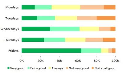
We might then present the results in a stacked bar chart e.g.:
I've tried to replicate this within Qlik Sense (September 2018 version), and have searched the community for an answer, but haven't found one as yet. At this stage I'm wondering would this be possible to replicate within Qlik, and if so, how?
Many thanks for any input.
PeJo.
- Mark as New
- Bookmark
- Subscribe
- Mute
- Subscribe to RSS Feed
- Permalink
- Report Inappropriate Content
- Mark as New
- Bookmark
- Subscribe
- Mute
- Subscribe to RSS Feed
- Permalink
- Report Inappropriate Content
- Mark as New
- Bookmark
- Subscribe
- Mute
- Subscribe to RSS Feed
- Permalink
- Report Inappropriate Content
Just take a look on our default help page:
OEM Solution Architect
LATAM
- Mark as New
- Bookmark
- Subscribe
- Mute
- Subscribe to RSS Feed
- Permalink
- Report Inappropriate Content
Hello,
Yes, so the field Monday contains answers for each respondent, same for Tuesday etc, as per the below example. That's how I currently have it stored, but I can restructure it if that's easier.
Thanks.
ID | Monday | Tuesday | Wednesday |
1 | Average | Average | Very good |
2 | Not very good | Average | Fairly good |
3 | Not good at all | Not good at all | Average |
4 | Fairly good | Very good | Very good |
Etc… |
|
|
|
- Mark as New
- Bookmark
- Subscribe
- Mute
- Subscribe to RSS Feed
- Permalink
- Report Inappropriate Content
I am not sure how easy or difficult it is for you to restructure the data outside of QlikView. But you can definitely restructure this in QlikView/Qlik Sense using The Crosstable Load. Once you have done that, you should have a fairly easy time working with the data to create the view you are looking to get
- Mark as New
- Bookmark
- Subscribe
- Mute
- Subscribe to RSS Feed
- Permalink
- Report Inappropriate Content
Ok, thanks. Yes, I can restructure it easily enough. Once I have would it then be easier to create that chart?
Many thanks.
- Mark as New
- Bookmark
- Subscribe
- Mute
- Subscribe to RSS Feed
- Permalink
- Report Inappropriate Content
This is how I loaded your sample data
Table:
CrossTable(WeekDay, Value)
LOAD * INLINE [
    ID, Monday, Tuesday, Wednesday
    1, Average, Average, Very good
    2, Not very good, Average, Fairly good
    3, Not good at all, Not good at all, Average
    4, Fairly good, Very good, Very good
];
and then create a chart with the following
Dimensions
WeekDay
Value
Expression
=Count(DISTINCT ID)/COUNT(TOTAL <WeekDay> DISTINCT ID)
and then played around with the settings to get this
- Mark as New
- Bookmark
- Subscribe
- Mute
- Subscribe to RSS Feed
- Permalink
- Report Inappropriate Content
Excellent, thanks very much. I shall have a play with that but it looks like what I was after. Thanks to everyone who responded, I read and appreciated all comments.
Cheers.

