Unlock a world of possibilities! Login now and discover the exclusive benefits awaiting you.
- Qlik Community
- :
- Forums
- :
- Analytics
- :
- New to Qlik Analytics
- :
- Re: Cumulative linegraph with multiple dimensions
- Subscribe to RSS Feed
- Mark Topic as New
- Mark Topic as Read
- Float this Topic for Current User
- Bookmark
- Subscribe
- Mute
- Printer Friendly Page
- Mark as New
- Bookmark
- Subscribe
- Mute
- Subscribe to RSS Feed
- Permalink
- Report Inappropriate Content
Cumulative linegraph with multiple dimensions
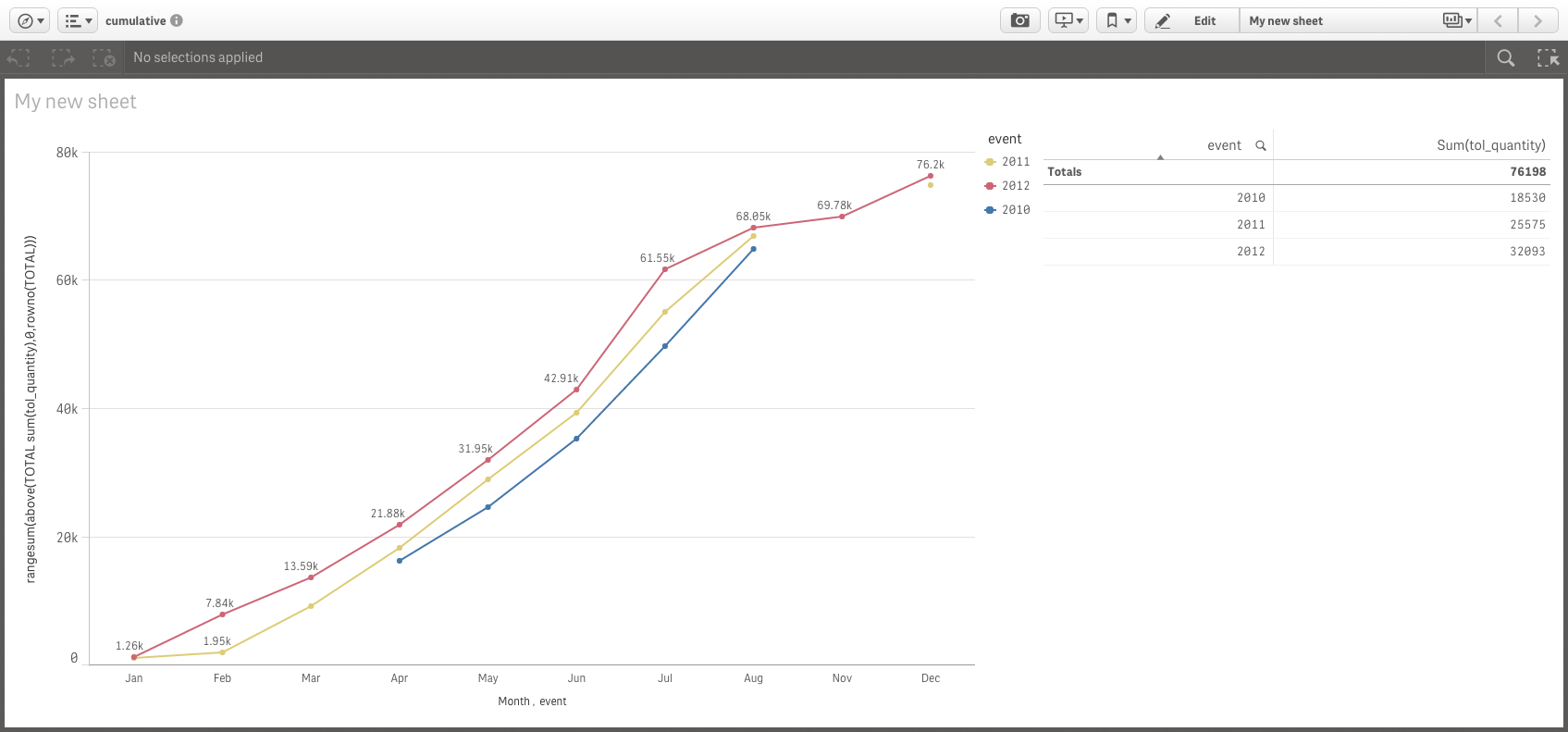
I want to create a linegraph showing sales per category for multiple years.
Below a screenshot of the datatable and the linegraph
What I try to achieve is
- X-Axis : showing the months
- 3 line graphs with monthly-cumulative ticketsales (tol_quantity) figures
Now the data for the 3 series seems to be mixed in stead of nicely grouped per dimension

- Mark as New
- Bookmark
- Subscribe
- Mute
- Subscribe to RSS Feed
- Permalink
- Report Inappropriate Content
Like this?
- Mark as New
- Bookmark
- Subscribe
- Mute
- Subscribe to RSS Feed
- Permalink
- Report Inappropriate Content
Thanks Manish. I am using Qlik Sense. Is it possible for you to share a qlik sense example / file?
- Mark as New
- Bookmark
- Subscribe
- Mute
- Subscribe to RSS Feed
- Permalink
- Report Inappropriate Content
Ok..
Here is the script
Load
*,
Year(to_date) as Year,
Month(to_date) as Month;
LOAD tol_id,
Date(Date#(to_date,'YYYY-MM-DD')) as to_date,
event,
tol_quantity
FROM
(ooxml, embedded labels, table is Sheet1);
Create a Line Chart
Dimension
Month
Year
Expression
rangesum(above(TOTAL sum(tol_quantity),0,rowno(TOTAL)))
- Mark as New
- Bookmark
- Subscribe
- Mute
- Subscribe to RSS Feed
- Permalink
- Report Inappropriate Content
Thanks a lot Manish.
After doublechecking, the lines do not show the correct totals
Note I added 'event' as a second dimension

- Mark as New
- Bookmark
- Subscribe
- Mute
- Subscribe to RSS Feed
- Permalink
- Report Inappropriate Content
Kindly close the thread by selecting correct answer..
- Mark as New
- Bookmark
- Subscribe
- Mute
- Subscribe to RSS Feed
- Permalink
- Report Inappropriate Content
Provide sample data to work.. I will check and update you.
- Mark as New
- Bookmark
- Subscribe
- Mute
- Subscribe to RSS Feed
- Permalink
- Report Inappropriate Content
Hi Manish, please find attached the (qlik sense) app and the data.
The 2 graphs show the problem, being that the data sets over which the totals are calculated should be narrowed down, in order to only use and sum the data of the corresponding event
- Mark as New
- Bookmark
- Subscribe
- Mute
- Subscribe to RSS Feed
- Permalink
- Report Inappropriate Content
gwassenaar not sure, but this might be a no-brainer for you to answer. Issue is that the rangesum should be calculated per dimension. It now includes all data within a given set (including data points of another dimension). Appreciate your advice on this one.
- Mark as New
- Bookmark
- Subscribe
- Mute
- Subscribe to RSS Feed
- Permalink
- Report Inappropriate Content
Something that was as simple as checking a box in QV is so difficult in QS. Anyone got an answer for how to accumulate over 2 dimensions for this exact post?