Unlock a world of possibilities! Login now and discover the exclusive benefits awaiting you.
- Qlik Community
- :
- Forums
- :
- Analytics
- :
- New to Qlik Analytics
- :
- Distinct aggregate function?
- Subscribe to RSS Feed
- Mark Topic as New
- Mark Topic as Read
- Float this Topic for Current User
- Bookmark
- Subscribe
- Mute
- Printer Friendly Page
- Mark as New
- Bookmark
- Subscribe
- Mute
- Subscribe to RSS Feed
- Permalink
- Report Inappropriate Content
Distinct aggregate function?
I need to plot a scatter chart that takes all the data from two columns (dimensions) and plots the distinct combinations of values.
Example:
| Day x-val | Amount y-val |
|---|---|
| 1 | 30 |
| 1 | 60 |
| 1 | 30 |
| 1 | 30 |
| 2 | 40 |
| 2 | 30 |
| 2 | 30 |
| 3 | 30 |
| 3 | 60 |
| 3 | 272 |
| 3 | 30 |
| 3 | 30 |
Plots:
| Day x-val | Amount y-val |
|---|---|
| 1 | 30 |
| 1 | 60 |
| 2 | 30 |
| 2 | 40 |
| 3 | 30 |
| 3 | 60 |
| 3 | 272 |
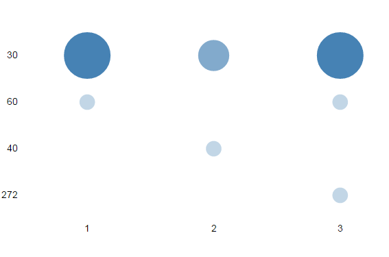
Ideally the frequency for each value would determine the size of the bubble:
| Day x-val | Amount y-val | Freq. bubble-size |
|---|---|---|
| 1 | 30 | 3 |
| 1 | 60 | 1 |
| 2 | 30 | 2 |
| 2 | 40 | 1 |
| 3 | 30 | 1 |
| 3 | 60 | 1 |
| 3 | 272 | 1 |
Any thoughts. Doesn't seem obvious in Qlik Sense.
Thanks in advance.
- Mark as New
- Bookmark
- Subscribe
- Mute
- Subscribe to RSS Feed
- Permalink
- Report Inappropriate Content
Seems pretty straightforward to me:
Dim1: Day x-val
Dim2: Amount y-val
Expression: count(Amount y-val)
---------
I correct myself, it is not as straightforward to implement in QlikSense as I thought - apologies for this. I managed to create something very close to it using an aggregated dimension utilizing the aggr() function.
- Mark as New
- Bookmark
- Subscribe
- Mute
- Subscribe to RSS Feed
- Permalink
- Report Inappropriate Content
Hi
Does something like that will help you :
you need to download the grid chart extension available on qlikbranch


attached sample app with your data
Regards
Bruno
- Mark as New
- Bookmark
- Subscribe
- Mute
- Subscribe to RSS Feed
- Permalink
- Report Inappropriate Content
Hi Scot,
The scatter plot in QlikSense needs atleast 2 measures and the 3rd measure shows the size of the bubble. As there are only 3 fields in totally this cannot be achieved using the implicit scatter plot. Instead you can achieve this using an extension as Bruno mentioned.
Make use of this expression to calculate the frequency.
aggr(count(Amountyval),Dayxval,Amountyval)
Thanks and Regards,
Sangram Reddy.
- Mark as New
- Bookmark
- Subscribe
- Mute
- Subscribe to RSS Feed
- Permalink
- Report Inappropriate Content
Thanks for your prompt replies.
It is becoming apparent to me that extensions are an important part of the Qlik universe. I will be able to check out the grid extension shortly.
Just wanted to let you know I saw your replies.
- Mark as New
- Bookmark
- Subscribe
- Mute
- Subscribe to RSS Feed
- Permalink
- Report Inappropriate Content
Ok. We're getting there.
Grid Extension visually represents the data, but doesn't seem to scroll like the scatter plot. The "day(x-vals)" values can get up into the 1000s so I need to be able scroll horizontally. The amount values (y-vals) scale needs to be dynamic to account for various ranges of amount. Our current Excel visualizations sort the data by "day" and connect each point adjacent point in the scatterplot with a line. It looks like the following:

The yellow is an overlay that we will eventually want to implement. The green dots are what I need to render in Qlik Sense. I need the scale on the left and bottom to be consistent.
We will eventually want to be able to put three sets of data on the same graph, turning them on or off. The excel version is very slow and static. We want an interactive dynamic capability for analysts.
There are three other visualizations that need to be rendered as well.