Unlock a world of possibilities! Login now and discover the exclusive benefits awaiting you.
- Qlik Community
- :
- Forums
- :
- Analytics
- :
- New to Qlik Analytics
- :
- Dividir gráfico
- Subscribe to RSS Feed
- Mark Topic as New
- Mark Topic as Read
- Float this Topic for Current User
- Bookmark
- Subscribe
- Mute
- Printer Friendly Page
- Mark as New
- Bookmark
- Subscribe
- Mute
- Subscribe to RSS Feed
- Permalink
- Report Inappropriate Content
Dividir gráfico
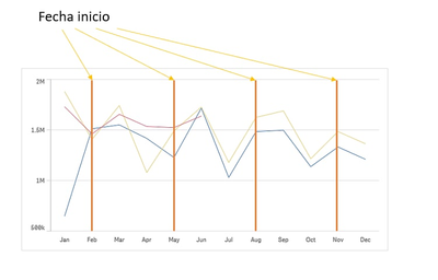
Hola quisiera crear en QlikSense un gráfico como el del ejemplo, pero no se agreguen las líneas que indican el inicio, en este caso es un evolutivo de ventas y quiero indicar cuándo tiene comienzo cada período promocional; tengo un campo en el data que se llama "fecha_inicio".
Muchas gracias.
Accepted Solutions
- Mark as New
- Bookmark
- Subscribe
- Mute
- Subscribe to RSS Feed
- Permalink
- Report Inappropriate Content
Hello,
If you have a few values in fecha_inicio field, then you can use a slightly hard coded solution such as:
1. Create a Line chart
2. Under Add-ons > Dimension reference lines you can create 4 different dimension reference lines with the following Reference line expressions:
- =Num(Month(FieldValue('fecha_inicio', '1')))
- =Num(Month(FieldValue('fecha_inicio', '2')))
- =Num(Month(FieldValue('fecha_inicio', '3')))
- =Num(Month(FieldValue('fecha_inicio', '4')))
Please note that for the FieldValue() function, you have to pass the arguments as strings for this to work. Further information can be found here [1].
3. This will give you the following output:
As you can see the reference lines appear as you need them and if you update the data in your dataset, then the reference lines will be updated as well. The only issue is, if you add more dates in your dataset, then you will have to manually create new dimension reference lines and if you have too many dimension reference lines, then this solution is not scalable.
As I have mentioned above, this solution is not scalable and it can only act as a quick fix for particular use case scenarios. In case you need a more scalable solution, you can take a look at the post here [2], which describes a similar issue in QlikView and the solution is to use Combo Chart. You might not be able to achieve your use case scenario 100% in Qlik Sense, but you can get an idea on how to proceed further or implement differently.
I hope that this information was helpful. In case I have misunderstood the use case scenario, please elaborate in details by providing additional information. However, if it has helped you resolve the issue, please mark it as accepted solution to give further visibility to other community members.
---
- Mark as New
- Bookmark
- Subscribe
- Mute
- Subscribe to RSS Feed
- Permalink
- Report Inappropriate Content
Hola, Andrei.
Antes de nada quisiera darte las gracias por tu detallada respuesta.
Me ha sido de gran ayuda.
un saludo.

