Unlock a world of possibilities! Login now and discover the exclusive benefits awaiting you.
- Qlik Community
- :
- Forums
- :
- Analytics
- :
- New to Qlik Analytics
- :
- Graphic with comparative data
Options
- Subscribe to RSS Feed
- Mark Topic as New
- Mark Topic as Read
- Float this Topic for Current User
- Bookmark
- Subscribe
- Mute
- Printer Friendly Page
Turn on suggestions
Auto-suggest helps you quickly narrow down your search results by suggesting possible matches as you type.
Showing results for
Not applicable
2016-05-20
03:00 PM
- Mark as New
- Bookmark
- Subscribe
- Mute
- Subscribe to RSS Feed
- Permalink
- Report Inappropriate Content
Graphic with comparative data
Dear friends, i need some help to recreate this type of graphic on qv.
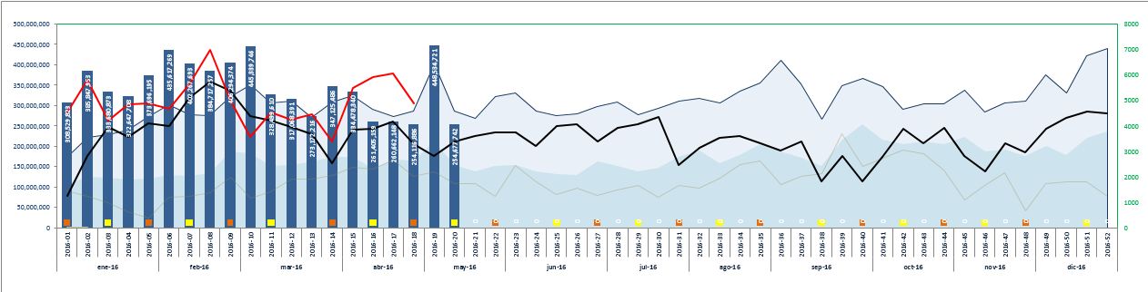
I have 5 expressions with a sum of the sales from year 2012 to 2016 and one dimension with the field "year-week" Comparing to the excel example, year 2016 should be the blue bars, and the other years should be the lightest blue areas. So i need to get this on my qlikview model, but i only get a long graphic showing bars from 2012 to 2016.
I hope you can help me.
Greetings!
207 Views
1 Reply
2016-05-22
11:22 AM
- Mark as New
- Bookmark
- Subscribe
- Mute
- Subscribe to RSS Feed
- Permalink
- Report Inappropriate Content
Qlikview or Qlik Sense?
Please post a Qlikview document or a Qlik Sense app with example document that illustrates the problem.
talk is cheap, supply exceeds demand
102 Views
Community Browser