Unlock a world of possibilities! Login now and discover the exclusive benefits awaiting you.
- Qlik Community
- :
- Forums
- :
- Analytics
- :
- New to Qlik Analytics
- :
- Heat Map Customize Color
- Subscribe to RSS Feed
- Mark Topic as New
- Mark Topic as Read
- Float this Topic for Current User
- Bookmark
- Subscribe
- Mute
- Printer Friendly Page
- Mark as New
- Bookmark
- Subscribe
- Mute
- Subscribe to RSS Feed
- Permalink
- Report Inappropriate Content
Heat Map Customize Color
Hi There,
This may be a silly question, I am trying to create my first Heat Map for sales growth and has been asked to customize ranges and colors. I have created the Heat Map, but can't find a way to customize color based on only 3 ranges:
0 to 3% Amber
3% up Green
Less than 0% Red
Thanks
Accepted Solutions
- Mark as New
- Bookmark
- Subscribe
- Mute
- Subscribe to RSS Feed
- Permalink
- Report Inappropriate Content
- Mark as New
- Bookmark
- Subscribe
- Mute
- Subscribe to RSS Feed
- Permalink
- Report Inappropriate Content
Hi Ajaa, I will reach out to my team to see if this is possible.
- Mark as New
- Bookmark
- Subscribe
- Mute
- Subscribe to RSS Feed
- Permalink
- Report Inappropriate Content
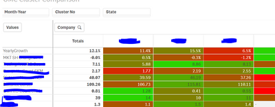
use following expression
ColorMix1( hrank(total column(1))/NoOfColumns(TOTAL) , lightgreen(),lightred()) in background color expression.
for e.g
If the issue is solved please mark the answer with Accept as Solution & like it.
If you want to go quickly, go alone. If you want to go far, go together.
- Mark as New
- Bookmark
- Subscribe
- Mute
- Subscribe to RSS Feed
- Permalink
- Report Inappropriate Content
Hi Vikasmahajan,
Thanks for your quick response, your answer is great using pivot table, which gave me the idea to change my heat map. Definitely I didn't clarify that I was using the "Heat Map Chart" under Custom Objects, Qlik Visualization bundle, wondering if there is a way to change colors by ranges using "Heat Map Chart"
- Mark as New
- Bookmark
- Subscribe
- Mute
- Subscribe to RSS Feed
- Permalink
- Report Inappropriate Content

