Unlock a world of possibilities! Login now and discover the exclusive benefits awaiting you.
- Qlik Community
- :
- Forums
- :
- Analytics
- :
- New to Qlik Analytics
- :
- Re: Hide Dimension values in piechart(qliksense)
- Subscribe to RSS Feed
- Mark Topic as New
- Mark Topic as Read
- Float this Topic for Current User
- Bookmark
- Subscribe
- Mute
- Printer Friendly Page
- Mark as New
- Bookmark
- Subscribe
- Mute
- Subscribe to RSS Feed
- Permalink
- Report Inappropriate Content
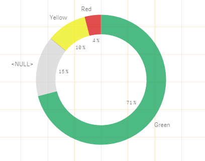
Hide Dimension values in piechart(qliksense)
In the pie chart , we see dimension value label ( like we see green, yellow , red ......) , we need to hide that . I see couple of discussions on this topic , but no answer . can you please guide .....
- Mark as New
- Bookmark
- Subscribe
- Mute
- Subscribe to RSS Feed
- Permalink
- Report Inappropriate Content
You can't do that in a pie chart;
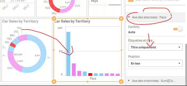
But if your whole point is to hide these labels; you can convert your pie chart to a bar one.
The under presentation, x-axis, hide the label:
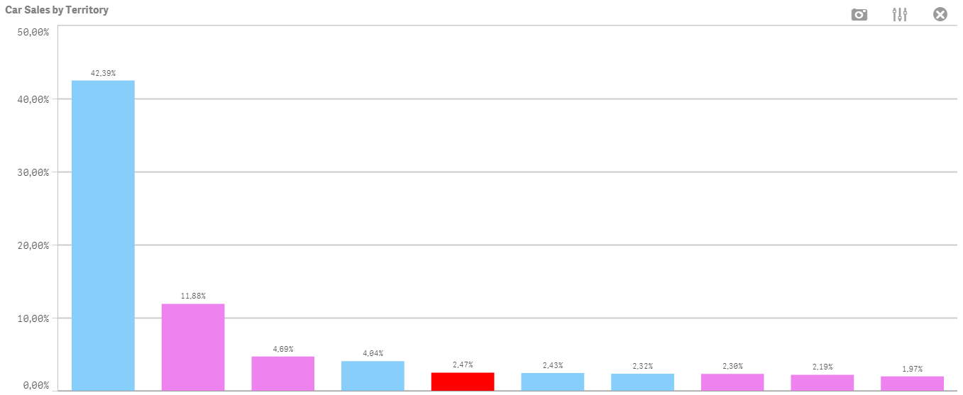
You can always keep the % in a bar chart;
Only you need to do is alter your measure:
Example:
From : Sum(Sales)
To: Sum(Sales) / Sum(Total Sales)
And format it as %:
- Mark as New
- Bookmark
- Subscribe
- Mute
- Subscribe to RSS Feed
- Permalink
- Report Inappropriate Content
I have the same problem I don't want to hide them but just show them to the left or bottom for a cleaner look. Still need the pie chart to show that the total is 100% which is not clear in a bar chart.