Unlock a world of possibilities! Login now and discover the exclusive benefits awaiting you.
- Qlik Community
- :
- Forums
- :
- Analytics
- :
- New to Qlik Analytics
- :
- Hiding non-associated entries in bar charts when u...
- Subscribe to RSS Feed
- Mark Topic as New
- Mark Topic as Read
- Float this Topic for Current User
- Bookmark
- Subscribe
- Mute
- Printer Friendly Page
- Mark as New
- Bookmark
- Subscribe
- Mute
- Subscribe to RSS Feed
- Permalink
- Report Inappropriate Content
Hiding non-associated entries in bar charts when using filters
Hi,
I must be missing something here or maybe the standard QS bar chart just doesn't do it easily.
A user wants to show all audit categories on a stacked bar chart along with the count of measures by status (which in the chart below are color-coded).
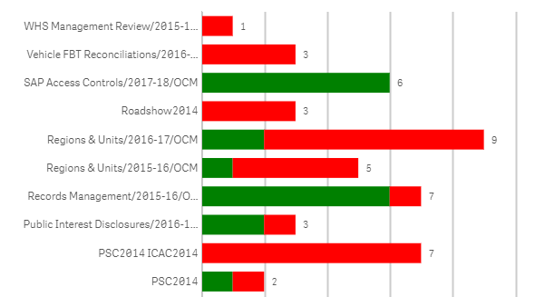
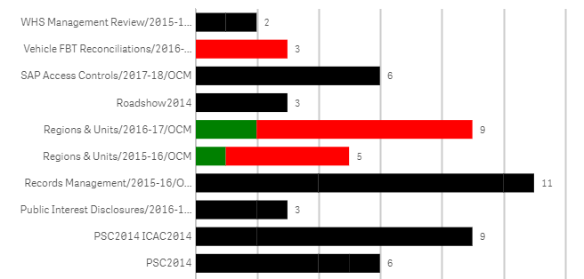
When the user makes a filter selection, they want any audit categories that are not associated with a filter selection to be hidden on the bar chart. In the chart below, once the filter is selected, these have changed to black. The black ones are the audit categories we want hidden.
I know this is possible with a pivot table, but is it possible with a stacked bar chart and if so, how can it be done?
Kind regards,
Wayde
- Mark as New
- Bookmark
- Subscribe
- Mute
- Subscribe to RSS Feed
- Permalink
- Report Inappropriate Content
I think the black ones are also the associated ones as they are coming up with some values , but according to your question when there are no associated values for a selection they shouldn't come up ,this is strange
- Mark as New
- Bookmark
- Subscribe
- Mute
- Subscribe to RSS Feed
- Permalink
- Report Inappropriate Content
what is your chart measure and what is your field selections ?
- Mark as New
- Bookmark
- Subscribe
- Mute
- Subscribe to RSS Feed
- Permalink
- Report Inappropriate Content
Hi Andrea and Kiran,
Based on your comments, I checked out the measure created by the user, removed the set analysis expression and created a conditional sum(if(..., 1,0)) expression. Selection using an associated filter now shows the relevant audit categories on the stacked bar chart.
Thank you both for your contributions and time.
Wayde