Unlock a world of possibilities! Login now and discover the exclusive benefits awaiting you.
- Qlik Community
- :
- Forums
- :
- Analytics
- :
- New to Qlik Analytics
- :
- Re: How to Show Null Data in a Chart (Power of Gra...
- Subscribe to RSS Feed
- Mark Topic as New
- Mark Topic as Read
- Float this Topic for Current User
- Bookmark
- Subscribe
- Mute
- Printer Friendly Page
- Mark as New
- Bookmark
- Subscribe
- Mute
- Subscribe to RSS Feed
- Permalink
- Report Inappropriate Content
How to Show Null Data in a Chart (Power of Gray)
How to Show Null Data in a Chart (Power of Gray)
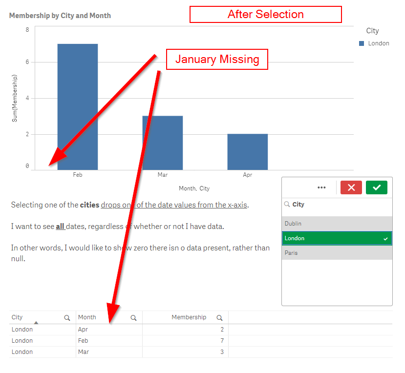
When making selections in a Qlik chart, the default behavior is to narrow down all dimensions in the chart to only those that have data. In other words, as you continue to drill into a Qlik object, the dimensions often present fewer and fewer options. Additionally, it might be the case that between data loads, your data changes and you no longer have any data for a given dimensional value.
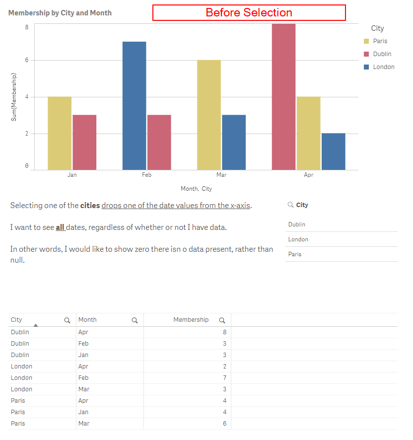
How do I create a chart object that has static dimensions, so that even when selections are made, the chart axes present ALL the dimensional values/combinations?
See screenshots below for more detail. If you are familiar with SAS, I’m looking for the PRELOADFMT option. This seems like it should be an option to go along with Qlik’s “Power of Gray” campaign.
Before Selection
After Selection
- Mark as New
- Bookmark
- Subscribe
- Mute
- Subscribe to RSS Feed
- Permalink
- Report Inappropriate Content
I have found a solution for this on Oleg Troyansky's blog post -
https://www.naturalsynergies.com/q-tip-20-showing-all-values-in-qlik-sense/
Note the solution I used was in the blog comment thread. Simply multiply the measure expression by Sum({1}1):
<MeasureExpression>*Sum({1}1)

