Unlock a world of possibilities! Login now and discover the exclusive benefits awaiting you.
- Qlik Community
- :
- Forums
- :
- Analytics
- :
- New to Qlik Analytics
- :
- How to create ABC & XYZ analysis in ClikSense?
- Subscribe to RSS Feed
- Mark Topic as New
- Mark Topic as Read
- Float this Topic for Current User
- Bookmark
- Subscribe
- Mute
- Printer Friendly Page
- Mark as New
- Bookmark
- Subscribe
- Mute
- Subscribe to RSS Feed
- Permalink
- Report Inappropriate Content
How to create ABC & XYZ analysis in ClikSense?
I use scatter plot to prepare ABC & XYZ analysis of goods. But scatter plot does not have any sorting of dimension to follow bubbles in ABC X-axis in correct way unlike of QlikView. What should I do to make visualization correct?
- Tags:
- abc-analyse
- xyz
- « Previous Replies
-
- 1
- 2
- Next Replies »
Accepted Solutions
- Mark as New
- Bookmark
- Subscribe
- Mute
- Subscribe to RSS Feed
- Permalink
- Report Inappropriate Content
- Mark as New
- Bookmark
- Subscribe
- Mute
- Subscribe to RSS Feed
- Permalink
- Report Inappropriate Content
Here we have two examples.
This example in QlikView

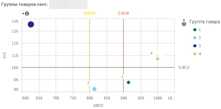
This example in QlikSense

As you can see the sorting is wrong ((
- Mark as New
- Bookmark
- Subscribe
- Mute
- Subscribe to RSS Feed
- Permalink
- Report Inappropriate Content
can you share sample app?
- Mark as New
- Bookmark
- Subscribe
- Mute
- Subscribe to RSS Feed
- Permalink
- Report Inappropriate Content
I can't speak Russian that well, but i found this
Hope it gives you some insights
ABC XYZ анализ в QlikView пример как сделать ABC XYZ анализ в рознице или дистрибьюции - YouTube
- Mark as New
- Bookmark
- Subscribe
- Mute
- Subscribe to RSS Feed
- Permalink
- Report Inappropriate Content
I know how to do ABC & XYZ analysis in QlikView. The problem is the QlikSense does not have sorting in scatter diagram unlike of QlikView. But sorting is very important to follow ABC values in axis X correctly. I can't understand how I can bypass this limitation.
- Mark as New
- Bookmark
- Subscribe
- Mute
- Subscribe to RSS Feed
- Permalink
- Report Inappropriate Content
Maybe try with extension object?
- Mark as New
- Bookmark
- Subscribe
- Mute
- Subscribe to RSS Feed
- Permalink
- Report Inappropriate Content
What extension do you mean?
- Mark as New
- Bookmark
- Subscribe
- Mute
- Subscribe to RSS Feed
- Permalink
- Report Inappropriate Content
On this page you can write "scatter" in the searchbox
And see if there are any extensions, which can work in your case
Have you worked with QlikSense or QV extensions before
- Mark as New
- Bookmark
- Subscribe
- Mute
- Subscribe to RSS Feed
- Permalink
- Report Inappropriate Content
Maybe this ?
- Mark as New
- Bookmark
- Subscribe
- Mute
- Subscribe to RSS Feed
- Permalink
- Report Inappropriate Content
I tried to use some of these yesterday but didn't find a solution yet. I try today. Maybe I missed something.
- « Previous Replies
-
- 1
- 2
- Next Replies »