Unlock a world of possibilities! Login now and discover the exclusive benefits awaiting you.
- Qlik Community
- :
- Forums
- :
- Analytics
- :
- New to Qlik Analytics
- :
- How to do a histogram?
- Subscribe to RSS Feed
- Mark Topic as New
- Mark Topic as Read
- Float this Topic for Current User
- Bookmark
- Subscribe
- Mute
- Printer Friendly Page
- Mark as New
- Bookmark
- Subscribe
- Mute
- Subscribe to RSS Feed
- Permalink
- Report Inappropriate Content
How to do a histogram?
Hi everyone!
I am not used to use QlikVio. Actually, this techonolgy is new for me, but in the future I will use it more often. Could you give some help?
I am lost in the midle of so much information and I am still trying to figure out how to work with this program. Can you give me the steps how to do a simple histogram?
I have a Data with numbers from 0 to 20. I want to do a histogram which counts how many numbers are in specifics times periods, such as:
]0,1[
]1,2[
]2,3[
]3,6[
]6,10[
]10,20[. How can I do it? I tried to calculate an dimension using if and then do a count for the data but it doesnt work.
I will grateful if some one could help me out.
Thanks in advance,
Best,
Pedro Pereira
- « Previous Replies
- Next Replies »
Accepted Solutions
- Mark as New
- Bookmark
- Subscribe
- Mute
- Subscribe to RSS Feed
- Permalink
- Report Inappropriate Content
The odd bin of '>10' doesn't allow for easy sorting so you have to get creative with 'Dual', then sort numerically;
=
If(Diferença<=1 ,Dual('0-1',0),
If(Diferença>1 and Diferença <=2,Dual('1-2',1),
If(Diferença>2 and Diferença <=3,Dual('2-3',2),
If(Diferença>3 and Diferença <=4,Dual('3-4',3),
If(Diferença>4 and Diferença <=5,Dual('4-5',4),
If(Diferença>5 and Diferença <=6,Dual('5-6',5),
If(Diferença>6 and Diferença <=7,Dual('6-7',6),
If(Diferença>7 and Diferença <=8,Dual('7-8',7),
If(Diferença>8 and Diferença <=9,Dual('8-9',8),
If(Diferença>9 and Diferença <=10,Dual('9-10',9),
If(Diferença>10,Dual('>10',10)
)))))))))))
- Mark as New
- Bookmark
- Subscribe
- Mute
- Subscribe to RSS Feed
- Permalink
- Report Inappropriate Content
This is the script you need
AAA:
LOAD * Inline [
Field
'0,1'
'1,2'
'2,3'
'3,6'
'6,10'
'10,20'
];
BBB: NoConcatenate
LOAD Field, Mid(Field, Index(Field, ',')+1)-Left(Field, Index(Field, ',')-1) as difference Resident AAA;
DROP Table AAA;
- Mark as New
- Bookmark
- Subscribe
- Mute
- Subscribe to RSS Feed
- Permalink
- Report Inappropriate Content
First, thanks for your answear!
Assuming I am a newbie, could you elaborate more about the objects (Inline, difference)? Could you explian in more detail?
What does "field" stand off? Where do you the count on your script?
Sorry to bother you that much, but as I said this software is new for me.
- Mark as New
- Bookmark
- Subscribe
- Mute
- Subscribe to RSS Feed
- Permalink
- Report Inappropriate Content
You can load data from Database, External files or in memory, this is the case of Load * inline Syntax,
I'm loading a field called Field with the values listed below.
Then I load again the same data (BBB) but I add a field:
... Mid(Field, Index(Field, ',')+1)-Left(Field, Index(Field, ',')-1) as difference ...
Where
Index(Field, ',') return the position of the comma between the couple of data (ex. 1,2 index returns 2, the position of comma)
Mid(...) returns a string from position Index(Field, ',')+1 to the end of the string (Field) so it returns for the first record 2
Left(...) returns a string from the starting point to the position Index(Field, ',')-1
So now I have the 2 numbers and do first-second as difference
hope this helps
- Mark as New
- Bookmark
- Subscribe
- Mute
- Subscribe to RSS Feed
- Permalink
- Report Inappropriate Content
I Hoped at least I was helpful ... could you mark?
- Mark as New
- Bookmark
- Subscribe
- Mute
- Subscribe to RSS Feed
- Permalink
- Report Inappropriate Content
Yes, you were. I rephrase again it is the first time I use this software.
I still havent figure out how to do the histogram from your script. Hopefully I will.
Thanks again anyway.
- Mark as New
- Bookmark
- Subscribe
- Mute
- Subscribe to RSS Feed
- Permalink
- Report Inappropriate Content
This is not as simple as it should be. I have a data with numbers which ranges from 0 to 20. And I have to do a chart/histogram and display/count the number between some specific intervals such as: 1 to 3, 3 to 4, 4,to 7 and 7 to 20.
How can I do that?
- Mark as New
- Bookmark
- Subscribe
- Mute
- Subscribe to RSS Feed
- Permalink
- Report Inappropriate Content
Hi Pedro,
To create a histogram you need to use the Class function in dimension. If your field is called AgeOfPerson then the expression you would use as the dimension expression would be something like this:
=class(AgeOfPerson ,3,'Age')
this means take the field call AgeofPerson and split it up into groups of 3 years. When writing the results use the word 'Age' between the values, e.g. 0<=Age<3
I've also attached an example with some data I had handy (it uses Salaries).
-Josh
Qlik
- Mark as New
- Bookmark
- Subscribe
- Mute
- Subscribe to RSS Feed
- Permalink
- Report Inappropriate Content
Hello,
The steps to create a Histogram,
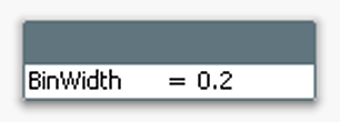
- Create an Input Box. In its properties, create a new variable called BinWidth. Click OK.
- Set BinWidth to 1 in the Input Box.
- Create a Bar Chart with a calculated dimension, using =Round(Value, BinWidth)
- Set the label for the calculated dimension to “Measurement”. Click Next.
- Use Count(Value) as expression. Click Next.
- Sort the calculated dimension numerically. Click Next three times.
- On the “Axes” page, enable “Continuous” on the Dimension Axis. Click Next.
- On the “Colors” page, disable the “Multicolored” under Data appearance. Click Finish.
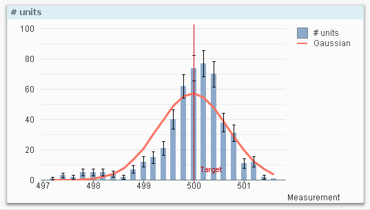
 You should now have a histogram. If you have too few bars, you need to make the bin width smaller. If you have too many, you should make it bigger. In order to make the histogram more elaborate you can also do the following:
- Add error bars to the bins. The error (uncertainty) of a bar is in this case the square root of the bar content, i.e. Sqrt(Count(Value))
- Add a second expression containing a Gaussian curve (bell curve):
- Convert the chart to a Combo chart
- Use the following as expression for the bell curve:
Only(Normdist(Round(Value,BinWidth),Avg(total Value),Stdev(total Value), 0))*BinWidth*Count(total Value) - Use bars for the measurement and line for the curve.
With these changes, you can quickly assess whether the measurements are normally distributed or whether there are some anomalies.
- Mark as New
- Bookmark
- Subscribe
- Mute
- Subscribe to RSS Feed
- Permalink
- Report Inappropriate Content
Pedro,
It sounds like a histogram is not what you're really looking for, but rather a chart that has specific inconsistent bucket sizes; 1-3, 3-4, 4-7 and 7-20.
In the script;
Load
If(Field<3,'1-3',
If(Field>3 and Field <=4,'3-4',
If(Field>4 and Field <=7,'4-7',
If(Field>7 and Field <=20,'7-20')))) as Bucket
From <Your Data>;
Then in a bar chart use Bucket as Dimension and Count(Bucket) as Expression. Then, sort Bucket by Text.
HTH,
John
- « Previous Replies
- Next Replies »
