Unlock a world of possibilities! Login now and discover the exclusive benefits awaiting you.
- Qlik Community
- :
- Forums
- :
- Analytics
- :
- New to Qlik Analytics
- :
- How to have bar chart show correct count?
- Subscribe to RSS Feed
- Mark Topic as New
- Mark Topic as Read
- Float this Topic for Current User
- Bookmark
- Subscribe
- Mute
- Printer Friendly Page
- Mark as New
- Bookmark
- Subscribe
- Mute
- Subscribe to RSS Feed
- Permalink
- Report Inappropriate Content
How to have bar chart show correct count?
Hello,
I am practicing using Qlik Sense by making a sample dashboard that displays visualizations based on Academy Awards data. I currently have a bar chart that is supposed to show the count of awards won by each actor on the datasource. Please see the screenshot here:
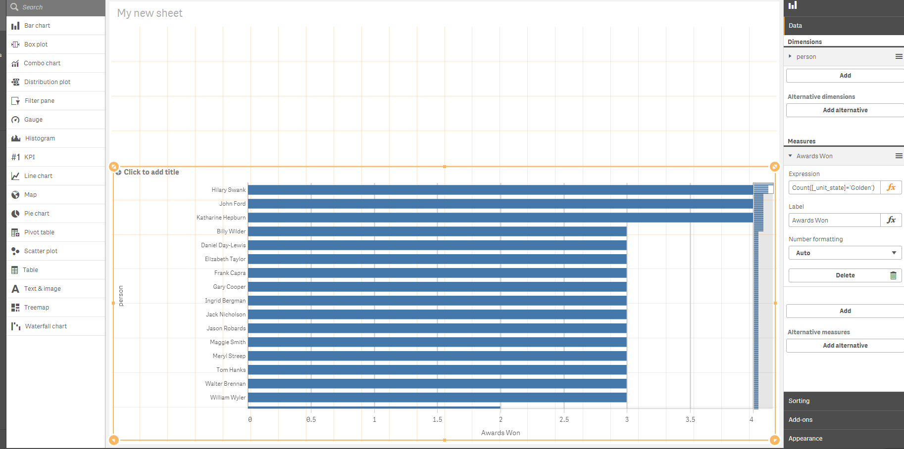
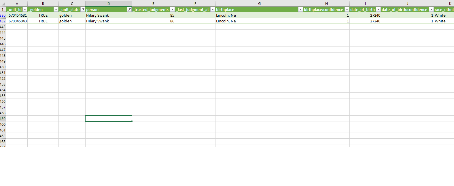
As you can see, according to the bar chart, Hilary Swank won 4 awards. This is NOT correct because Hilary Swank actually won 2 awards according to the datasource being used. Please see here:
The bar chart is really showing the number of NOMINATIONS for the actors, not the actual number of awards won. Hilary Swank got 4 nominations, but won it twice.
How can I change the bar chart to show the values in the chart to match the datasource? I thought I used the correct formula, but apparently that is not. THANK YOU in advance for your assistance!
Accepted Solutions
- Mark as New
- Bookmark
- Subscribe
- Mute
- Subscribe to RSS Feed
- Permalink
- Report Inappropriate Content
- Mark as New
- Bookmark
- Subscribe
- Mute
- Subscribe to RSS Feed
- Permalink
- Report Inappropriate Content
something like this:
=count({<[_unit_state]={'golden'}>}Nominations)
- Mark as New
- Bookmark
- Subscribe
- Mute
- Subscribe to RSS Feed
- Permalink
- Report Inappropriate Content
Thank you sir! That solved the issue perfectly!
- Mark as New
- Bookmark
- Subscribe
- Mute
- Subscribe to RSS Feed
- Permalink
- Report Inappropriate Content
I was wondering, what's the purpose of the curly brackets? When are they typically used in a formula?
- Mark as New
- Bookmark
- Subscribe
- Mute
- Subscribe to RSS Feed
- Permalink
- Report Inappropriate Content
In the following link you can find more information regarding the set analyis. There are many things that you should know: Set Analysis: syntaxes, examples