Unlock a world of possibilities! Login now and discover the exclusive benefits awaiting you.
- Qlik Community
- :
- Forums
- :
- Analytics
- :
- New to Qlik Analytics
- :
- How to show cumulative reduction per month in a gr...
- Subscribe to RSS Feed
- Mark Topic as New
- Mark Topic as Read
- Float this Topic for Current User
- Bookmark
- Subscribe
- Mute
- Printer Friendly Page
- Mark as New
- Bookmark
- Subscribe
- Mute
- Subscribe to RSS Feed
- Permalink
- Report Inappropriate Content
How to show cumulative reduction per month in a graph
Hi there,
I want to show in a graph the cumulative reduction of m2.
These are my variables:
- I have to exclude the following "Status_property" (Sold and Rent expired)
- I have to Sum the amount of "M2"
- The x-axis is based on the date field "Period" (YYYY-MM)
These steps I have to take (I think)
Per Period:
(Get the aggregated sum of M2 s, where Status_property is not equal to "Sold" or "Rent expired" for the recent month
minus
Get the aggregated sum of M2 s, where Status_property is not equal to "Sold" or "Rent expired" for the previous month)
However, this will show me the reduction for each month and not the cumulative reduction. Also, I cant manage to get this in a code.
Help would be appreciated!
- Mark as New
- Bookmark
- Subscribe
- Mute
- Subscribe to RSS Feed
- Permalink
- Report Inappropriate Content
Would you be able to share a sample or sample data with the expected output to help you better
- Mark as New
- Bookmark
- Subscribe
- Mute
- Subscribe to RSS Feed
- Permalink
- Report Inappropriate Content
Ha Sunny,
sorry for the delayed reply.
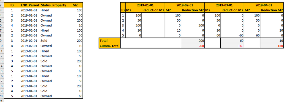
Here is a picture. Left u see a small table with some relevant sample data.
- ID - Unique Identifier
- LNK_Period - Moment of measurement
- Status_Property - If the property is owned, Hired of Sold
- M2 - M2 of each property
What I want to achieve is the following (see tabel on the right side):
I want to show the cumulative volume of reduction per Year-Month in a graph. The volume should be equal to the volumes which are marked red in the right side table.
So during 2019 there has been 3 changes:
- 2019-02 ; ID 3 has been sold (positive influence of 200m2 on reduction)
- 2019-03; ID 5 has been bought (negative influence of 60m2 on reduction)
- 2019-04; ID 4 has been sold (positive influence on reduction 10m2)
So I am wondering what the code is to get the same results as posted in the laste line of the right table (the figures in red).
I hope you can help me.
Kr
Martijn
- Mark as New
- Bookmark
- Subscribe
- Mute
- Subscribe to RSS Feed
- Permalink
- Report Inappropriate Content
Would you be able to share the sample data as text instead of image?
