Unlock a world of possibilities! Login now and discover the exclusive benefits awaiting you.
- Qlik Community
- :
- Forums
- :
- Analytics
- :
- New to Qlik Analytics
- :
- Is it possible to add straight lines to scatter pl...
Options
- Subscribe to RSS Feed
- Mark Topic as New
- Mark Topic as Read
- Float this Topic for Current User
- Bookmark
- Subscribe
- Mute
- Printer Friendly Page
Turn on suggestions
Auto-suggest helps you quickly narrow down your search results by suggesting possible matches as you type.
Showing results for
Not applicable
2017-04-03
08:22 AM
- Mark as New
- Bookmark
- Subscribe
- Mute
- Subscribe to RSS Feed
- Permalink
- Report Inappropriate Content
Is it possible to add straight lines to scatter plot?
I want the graph looks like the option in excel but couldn't find any solution.
- Tags:
- scatter plot
603 Views
2 Replies
Not applicable
2017-04-03
09:01 AM
Author
- Mark as New
- Bookmark
- Subscribe
- Mute
- Subscribe to RSS Feed
- Permalink
- Report Inappropriate Content
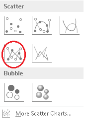
Thank you for the answer. My question wasn't about the grids actually.
I want to have the scatter marks connected with lines which is shown in the circle on the following image:
500 Views
Luminary Alumni
2017-04-03
09:14 AM
- Mark as New
- Bookmark
- Subscribe
- Mute
- Subscribe to RSS Feed
- Permalink
- Report Inappropriate Content
Have a look at the Vizlib Scatter Chart extension for Qlik Sense which has rich formatting options, just as you're used to in Excel:
Community Browser