Unlock a world of possibilities! Login now and discover the exclusive benefits awaiting you.
Announcements
Accelerate Your Success: Fuel your data and AI journey with the right services, delivered by our experts.
Learn More
- Qlik Community
- :
- Forums
- :
- Analytics
- :
- New to Qlik Analytics
- :
- Make label values nice on combo chart
Options
- Subscribe to RSS Feed
- Mark Topic as New
- Mark Topic as Read
- Float this Topic for Current User
- Bookmark
- Subscribe
- Mute
- Printer Friendly Page
Turn on suggestions
Auto-suggest helps you quickly narrow down your search results by suggesting possible matches as you type.
Showing results for
Anonymous
Not applicable
2017-09-29
07:43 AM
- Mark as New
- Bookmark
- Subscribe
- Mute
- Subscribe to RSS Feed
- Permalink
- Report Inappropriate Content
Make label values nice on combo chart
I am trying to make labels look nicely use friendly on a combo chart.
I have set the Y-axis like this
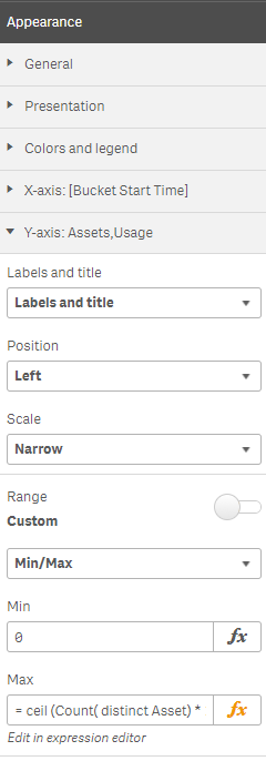
Where the full Max expression is
= ceil (
Count( distinct Asset) * 1.1 ,
num ( '1' & repeat ( 0 , if ( len(Count( distinct Asset) ) = 1 , 1 ,len(Count( distinct Asset) ) -1 ) ) )
)
This generally works quite nicely, but when (Count( distinct Asset) ) resolves to 62 then the labels show at non uniform intervals as 0, 20 , 40 & 70.

Ideally I would like the labels at uniform intervals, as in 0, 20 , 40, 60 & 80.
Anybody got any cunning suggestions ?
260 Views
0 Replies
Community Browser