Unlock a world of possibilities! Login now and discover the exclusive benefits awaiting you.
- Qlik Community
- :
- Forums
- :
- Analytics
- :
- New to Qlik Analytics
- :
- Problem with Color by Dimension
- Subscribe to RSS Feed
- Mark Topic as New
- Mark Topic as Read
- Float this Topic for Current User
- Bookmark
- Subscribe
- Mute
- Printer Friendly Page
- Mark as New
- Bookmark
- Subscribe
- Mute
- Subscribe to RSS Feed
- Permalink
- Report Inappropriate Content
Problem with Color by Dimension
Hi mto,
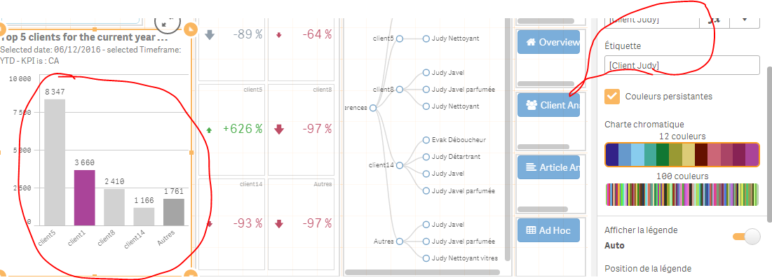
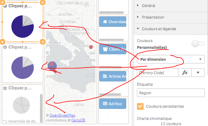
Another thing with Qlik Sense 3.2 is the color by dimension; In fact, every time I choose to colour by dimension, I see only one value colored.
Here's an example:
Here's another one:
Thank you,
- Tags:
- color by
- Mark as New
- Bookmark
- Subscribe
- Mute
- Subscribe to RSS Feed
- Permalink
- Report Inappropriate Content
Hello Omar,
I think this has to do with the way the data is associated, example: one to many or many to one.
In this case for the pie charts you are coloring slices that belong to multiple regions (terror code). Hence it becomes light gray. If each slice only belonged to one you would get colors on each slide.
Try this: Take one of the pie charts and copy it. Then convert it to a table and then add [Terrory Code] as a new column. You will see which slices has multiple values.
When applicable please mark the appropriate replies as CORRECT. This will help community members and Qlik Employees know which discussions have already been addressed and have a possible known solution. Please mark threads as HELPFUL if the provided solution is helpful to the problem, but does not necessarily solve the indicated problem. You can mark multiple threads as HELPFUL if you feel additional info is useful to others.
Regards,
Michael Tarallo (@mtarallo) | Twitter
Qlik
Mike Tarallo
Qlik
- Mark as New
- Bookmark
- Subscribe
- Mute
- Subscribe to RSS Feed
- Permalink
- Report Inappropriate Content
Hi Michael, The dimension in the pie chart is also terrory code
- Mark as New
- Bookmark
- Subscribe
- Mute
- Subscribe to RSS Feed
- Permalink
- Report Inappropriate Content
Hi Omar - please attach the screenshot of the table I mentioned in the previous post. If there are multiple territory codes in a particular region - this is why. If you can attach your .qvf file as well that will help.
Thanks
Mike Tarallo
Qlik