Unlock a world of possibilities! Login now and discover the exclusive benefits awaiting you.
- Qlik Community
- :
- Forums
- :
- Analytics
- :
- New to Qlik Analytics
- :
- Qlik Sense Bar Chart help required
- Subscribe to RSS Feed
- Mark Topic as New
- Mark Topic as Read
- Float this Topic for Current User
- Bookmark
- Subscribe
- Mute
- Printer Friendly Page
- Mark as New
- Bookmark
- Subscribe
- Mute
- Subscribe to RSS Feed
- Permalink
- Report Inappropriate Content
Qlik Sense Bar Chart help required
Hi,
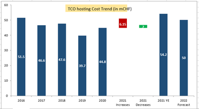
I want the bar chart to be displayed as follows
the data for above chart is as below
| Series | 2016 | 2017 | 2018 | 2019 | 2020 | 2021 Increases | 2021 Decreases | 2021 YE | 2022 Forecast |
| TCO Hosting(mCHF) | 44.8 | 44.8 | |||||||
| Decreases | 6.15 | 2 | |||||||
| Increases | 51.5 | 46.6 | 47.6 | 39.7 | 44.8 | 54.2 | 50 |
the condition is the values for 2021 Increases bar should be in red color & should be above & 2021 Decreases should be in green color & above.
Thanks In Advance
@avinashelite @kushalthakral @tresesco @prabir_c @eliran @MayilVahanan @its_anandrjs @MK_QSL @anbu1984 @marcus_sommer
- Tags:
- chart
- qlik sense app
- Mark as New
- Bookmark
- Subscribe
- Mute
- Subscribe to RSS Feed
- Permalink
- Report Inappropriate Content
like this you mean?
- Mark as New
- Bookmark
- Subscribe
- Mute
- Subscribe to RSS Feed
- Permalink
- Report Inappropriate Content
Yes but you have done it in QlikView & I wanted it in Qlik Sense.
Could you please guide me how to do that in Qlik Sense ?
Thanks
- Mark as New
- Bookmark
- Subscribe
- Mute
- Subscribe to RSS Feed
- Permalink
- Report Inappropriate Content
Oh, I missed the blog root 🙂
Anyway, There is no way as such so far in Qlik Sense. But If you have only few values, I would suggest this way? Let's see If @ChristofSchwarz can assist more on this.
- Mark as New
- Bookmark
- Subscribe
- Mute
- Subscribe to RSS Feed
- Permalink
- Report Inappropriate Content
Hi @Anil_Babu_Samineni ,
Thanks for your kind help, It looks fine only thing is the color coding is missing for 2021 Increasing color is red & 2021 decreasing color code is green. How to apply color for these specific two ? could you please guide?
@ChristofSchwarz your opinion will be appreciated.
Thanks
- Mark as New
- Bookmark
- Subscribe
- Mute
- Subscribe to RSS Feed
- Permalink
- Report Inappropriate Content
- Mark as New
- Bookmark
- Subscribe
- Mute
- Subscribe to RSS Feed
- Permalink
- Report Inappropriate Content
Hi Anil,
Better can you publish a step by step process to develop such type of chart in Qliksnese.
Bit of document for this so other can refer.
Regards,
Anand
- Mark as New
- Bookmark
- Subscribe
- Mute
- Subscribe to RSS Feed
- Permalink
- Report Inappropriate Content
Hi Anand, Yes that is good idea 🙂
TBH, I have not got workaround like similar to the user using Qlik Sense otherwise I could have done that.

