Unlock a world of possibilities! Login now and discover the exclusive benefits awaiting you.
- Qlik Community
- :
- Forums
- :
- Analytics
- :
- New to Qlik Analytics
- :
- Qlik Sense: Simple line chart visualization with d...
- Subscribe to RSS Feed
- Mark Topic as New
- Mark Topic as Read
- Float this Topic for Current User
- Bookmark
- Subscribe
- Mute
- Printer Friendly Page
- Mark as New
- Bookmark
- Subscribe
- Mute
- Subscribe to RSS Feed
- Permalink
- Report Inappropriate Content
Qlik Sense: Simple line chart visualization with date on x-axis
Hi all,
I'm brand-new to Qlik and really want to love it, but I must admit that right out the gate, I'm completely baffled on how to do even the simplest-seeming thing.
I'm trying to create a dashboard for an IVR system that takes several million calls a month, so I'm playing around with an extract of 3 days' worth of data until I get my feet wet. The first visualization I tried to create is a line chart showing number of calls into the system charted over time. My x-axis data is in the form of timestamps:
9/12/2014 12:00:15 AM
9/12/2014 12:00:17 AM
9/12/2014 12:00:22 AM
etc.
When I wrap the variable (StartTime) in the Date#( ) function it converts it to the long integer-looking data
41894.000015
41894.000017
41894.000022
etc.
My y-axis is a simple count of CallID's.
No matter how I create the line chart, it tries to display every value of the date, either as-is without wrapping it in Date#(), or as those long numbers. I can't figure out how to format the axis to create intervals based on day (which would be 3 values since it's 3 days' worth of data), or hour (72 values over a 3-day period, presumably I'd be able to display them grouped to whatever # of hours makes sense.
Anyhow, I'm sure I must be missing something extremely obvious, and hopefully once it's pointed out, I can figure other things out as well, but I've literally scoured the documentation and forums, watched videos, and tried a million things, without any success.
Thanks in advance for your help!
- « Previous Replies
-
- 1
- 2
- Next Replies »
- Mark as New
- Bookmark
- Subscribe
- Mute
- Subscribe to RSS Feed
- Permalink
- Report Inappropriate Content
Hi again 
Now that the long weekend is over I'm back at it.
I actually had a call with Qlik this afternoon that was very helpful. I incorporated Jonathan's ideas plus a bit of extra magic. I'll post more of my ultimate solution when it takes more shape.
Thanks again for all the input!
- Mark as New
- Bookmark
- Subscribe
- Mute
- Subscribe to RSS Feed
- Permalink
- Report Inappropriate Content
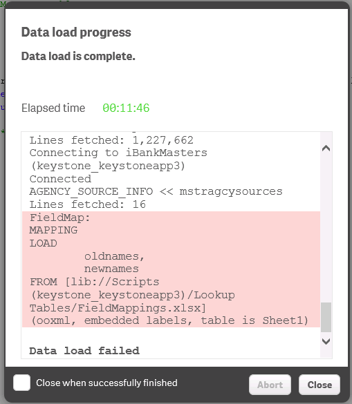
Attached is the error from the full data reload - doesn't reveal much more.
- « Previous Replies
-
- 1
- 2
- Next Replies »