Unlock a world of possibilities! Login now and discover the exclusive benefits awaiting you.
- Qlik Community
- :
- Forums
- :
- Analytics
- :
- New to Qlik Analytics
- :
- Qlik sense filter and Executive Dashboard demo Sal...
- Subscribe to RSS Feed
- Mark Topic as New
- Mark Topic as Read
- Float this Topic for Current User
- Bookmark
- Subscribe
- Mute
- Printer Friendly Page
- Mark as New
- Bookmark
- Subscribe
- Mute
- Subscribe to RSS Feed
- Permalink
- Report Inappropriate Content
Qlik sense filter and Executive Dashboard demo Sales Analysis question
I have one question about Qlik sense filter and Executive Dashboard demo Sales Analysis and would like to ask for your help.
Executive Dashboard demo is at:
http://sense-demo.qlik.com/details/ExecutiveDashboard
Executive Dashboard Sales Analysis is at:
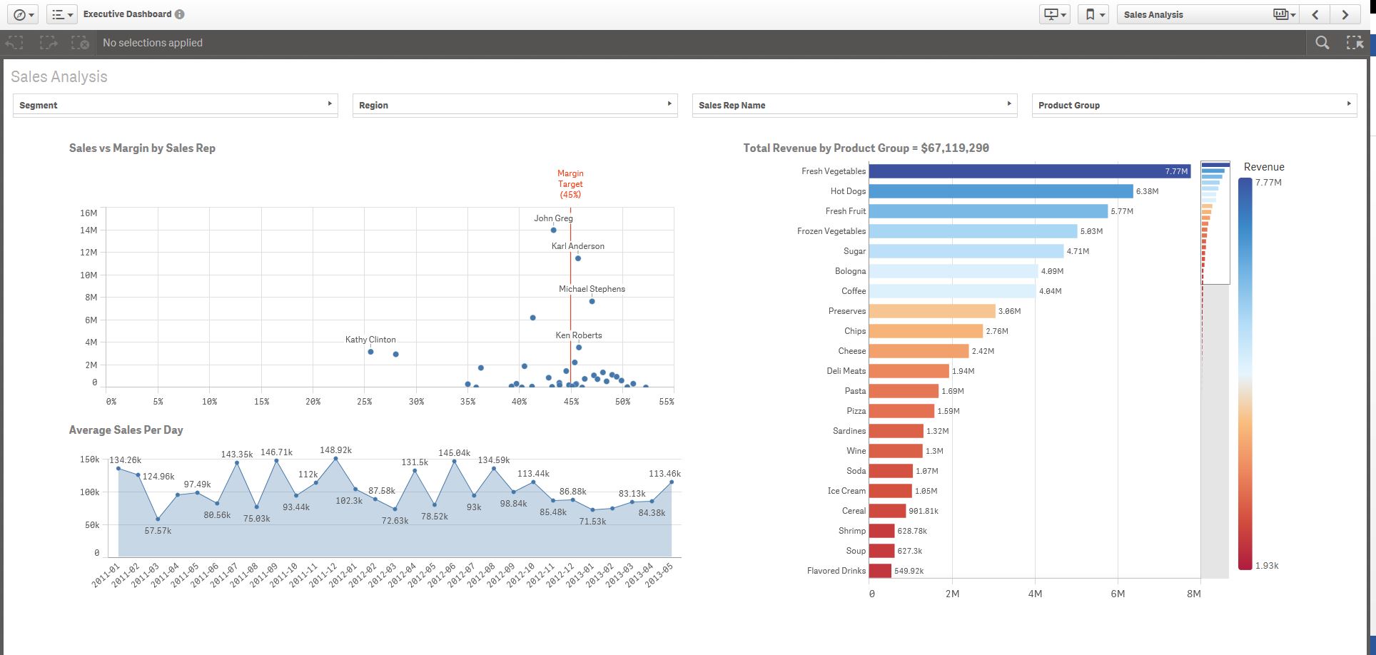
Before we select a filter, all the filters (Segment, Region, Sales Rep Name, Product Group) look like as the following:
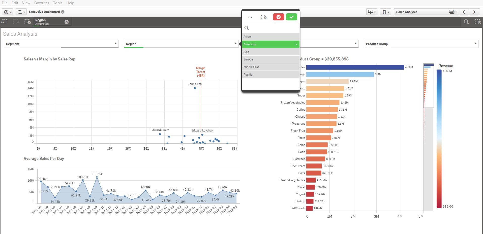
After we select a filter, for example, Americas in Region field, other fields (Segment, Sales Rep Name) will become white and gray.
Is it possible to still keep other fields (Segment, Sales Rep Name) no change (looks as the same before we select Americas in Region field) when we select Americas in Region field?
Thanks for your help!
Accepted Solutions
- Mark as New
- Bookmark
- Subscribe
- Mute
- Subscribe to RSS Feed
- Permalink
- Report Inappropriate Content
We finally hide the Green/White/Gray in Qlik mashup.
- Mark as New
- Bookmark
- Subscribe
- Mute
- Subscribe to RSS Feed
- Permalink
- Report Inappropriate Content
What you see is Qlik default behaviour and actually quite useful.
Why do you want to change it?
- Mark as New
- Bookmark
- Subscribe
- Mute
- Subscribe to RSS Feed
- Permalink
- Report Inappropriate Content
Swuehl, thanks so much for your help!
I would like to set these different filters work independently. When we select one filter, other filters do not change. Could you please give any suggestion?
One more question is that I would like to create a pie chart with Qlik sense. The table structure is building_type column, building_value column. I use building_type column as dimension and use building_value column as measure. I would to show the pie chart when all building_value bigger than 10, and only show building_value as text when there is building_value less than 10. Could you please give any suggestion?
Thanks!
- Mark as New
- Bookmark
- Subscribe
- Mute
- Subscribe to RSS Feed
- Permalink
- Report Inappropriate Content
I would like to create a pie chart with Qlik sense. The table structure is building_type column, building_value column. I use building_type column as dimension and use building_value column as measure. I would to show the pie chart when all building_value bigger than 10, and only show building_value as text when there is building_value less than 10.
I try to use expression at measure as the following, but it does not work.
If ( [building_value]<10, 'Building value less than: ' &[building_value], Sum([building_value]) )
I also tried to use Calculation condition and Displayed message at Data handing;
Calculation condition: [building_value]<10
Displayed message: 'Building value less than: ' &[building_value]
Could you please give any suggestion?
Thanks so much for your help!
- Mark as New
- Bookmark
- Subscribe
- Mute
- Subscribe to RSS Feed
- Permalink
- Report Inappropriate Content
Swuehl, thanks so much for your help!
When we select with Qlik sense, the selected item will become Green, the related item will become White, and the Un-related item will become Gray. I use one demo from Qlik as the example.
Is it possible to not show these Green, White and Gray when we select with Qlik? If so, how could we change or set it at Qlik?
Thanks!
- Mark as New
- Bookmark
- Subscribe
- Mute
- Subscribe to RSS Feed
- Permalink
- Report Inappropriate Content
We finally hide the Green/White/Gray in Qlik mashup.