Unlock a world of possibilities! Login now and discover the exclusive benefits awaiting you.
- Qlik Community
- :
- Forums
- :
- Analytics
- :
- New to Qlik Analytics
- :
- Screen adjustment when using in mobiles and tablet...
- Subscribe to RSS Feed
- Mark Topic as New
- Mark Topic as Read
- Float this Topic for Current User
- Bookmark
- Subscribe
- Mute
- Printer Friendly Page
- Mark as New
- Bookmark
- Subscribe
- Mute
- Subscribe to RSS Feed
- Permalink
- Report Inappropriate Content
Screen adjustment when using in mobiles and tablets
Hello all,
I would like to know if I have a lot of graphs in a sheet of an app (I did the development in computer) and then i want to work with it in a mobile phone.. It appears a drill down to see all the graphs??
How it works the screen adjustment and resolutions the same app between different devices?
Thanks in advance!!
- Tags:
- screen resolution
Accepted Solutions
- Mark as New
- Bookmark
- Subscribe
- Mute
- Subscribe to RSS Feed
- Permalink
- Report Inappropriate Content
Hi Anna,
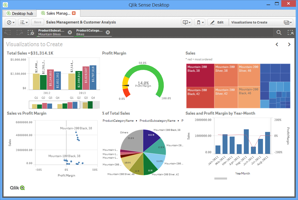
While viewing on a mobile device, the layout of these visualizations change, they go one below the other and look the same way. As In your example, you have 3 visualizations in each row, (3 on top and 3 below) but where as in a smaller screen, it will re arrange itself and the visualizations will be arranged one below the other.
For testing, just simply reduce the width of your browser. You will see that the visualizations shift one below the other.
Thanks,
Sangram.
- Mark as New
- Bookmark
- Subscribe
- Mute
- Subscribe to RSS Feed
- Permalink
- Report Inappropriate Content
Try using the autozoom macro. I'm not sure if it works with Ajax client.
- Mark as New
- Bookmark
- Subscribe
- Mute
- Subscribe to RSS Feed
- Permalink
- Report Inappropriate Content
Hi,
Trigger the below macro in
Sub FitZoomToWindow
ActiveDocument.GetApplication.WaitForIdle
ActiveDocument.ActiveSheet.FItZoomToWindow
End Sub
Settings -> Document Properties -> Triggers -> On open -> Add Action -> Add -> External -> Run Macro -> Give Macro Name (FitZoomToWindow)
Before that paste the above macro code in the Edit Module window (Ctrl + M).
For some other sample macros check the link below
HTH
Vikas
If the issue is solved please mark the answer with Accept as Solution & like it.
If you want to go quickly, go alone. If you want to go far, go together.
- Mark as New
- Bookmark
- Subscribe
- Mute
- Subscribe to RSS Feed
- Permalink
- Report Inappropriate Content
Hi Anna,
Qliksense sense has a responsive design and hence you will face no issue viewing the dashboards in any device.
Thanks,
Sangram.
- Mark as New
- Bookmark
- Subscribe
- Mute
- Subscribe to RSS Feed
- Permalink
- Report Inappropriate Content
Hi,
In Qliksense you don't need to do anything, it is auto responsive based on the screen size it will automatically adjust.
Regards,
Jagan.
- Mark as New
- Bookmark
- Subscribe
- Mute
- Subscribe to RSS Feed
- Permalink
- Report Inappropriate Content
Ok but I mean, If I have 6 graphs (as the image as I see it in my computer) in the app
when I open it in a small device such as a cellphone (not too big).. It will appear a drill down? in order to not see it very small the whole sheet and have the possibility to see each graph detailed??
Or it will be exactly like this image in all the devices I use?? (independently of the screen size)
Sorry for being insistent, I just want to be sure that I'm explaining well (sorry for my english haha)

- Mark as New
- Bookmark
- Subscribe
- Mute
- Subscribe to RSS Feed
- Permalink
- Report Inappropriate Content
Hi Anna,
While viewing on a mobile device, the layout of these visualizations change, they go one below the other and look the same way. As In your example, you have 3 visualizations in each row, (3 on top and 3 below) but where as in a smaller screen, it will re arrange itself and the visualizations will be arranged one below the other.
For testing, just simply reduce the width of your browser. You will see that the visualizations shift one below the other.
Thanks,
Sangram.
- Mark as New
- Bookmark
- Subscribe
- Mute
- Subscribe to RSS Feed
- Permalink
- Report Inappropriate Content
Thank you Sangram!! I understand now!
- Mark as New
- Bookmark
- Subscribe
- Mute
- Subscribe to RSS Feed
- Permalink
- Report Inappropriate Content
Always Welcome!