Unlock a world of possibilities! Login now and discover the exclusive benefits awaiting you.
- Qlik Community
- :
- Forums
- :
- Analytics
- :
- New to Qlik Analytics
- :
- Set axis
- Subscribe to RSS Feed
- Mark Topic as New
- Mark Topic as Read
- Float this Topic for Current User
- Bookmark
- Subscribe
- Mute
- Printer Friendly Page
- Mark as New
- Bookmark
- Subscribe
- Mute
- Subscribe to RSS Feed
- Permalink
- Report Inappropriate Content
Set axis
Hi, I have a doubt in QlikSense
For example, I have some Sales for products each month. Later I need to filter by customer.
If I draw a graph in which the dimensions are months and Products, I'll see the correct chart because I have data in all months.
But if I filter by some customer that has data only in some months, The "X" axis is reduced and it shows only the months that have sales amount.
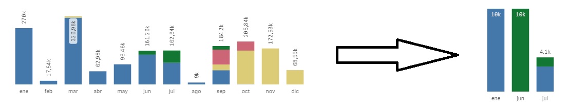
I want to set this axis and the chart shows every month whether or not they amount sales. If you do not have me show a 0 but it will be consider in the chart.
Thanks in advance
Regards
- Tags:
- axes
- qlik sense
Accepted Solutions
- Mark as New
- Bookmark
- Subscribe
- Mute
- Subscribe to RSS Feed
- Permalink
- Report Inappropriate Content
Try changing your expression by adding +sum({1}0) to it. The result will be that all months are always shown at the x-axis regardless of any selections.
talk is cheap, supply exceeds demand
- Mark as New
- Bookmark
- Subscribe
- Mute
- Subscribe to RSS Feed
- Permalink
- Report Inappropriate Content
Thanks Gysbert!