Unlock a world of possibilities! Login now and discover the exclusive benefits awaiting you.
- Qlik Community
- :
- Forums
- :
- Analytics
- :
- New to Qlik Analytics
- :
- Re: Show only years where percentage different tha...
- Subscribe to RSS Feed
- Mark Topic as New
- Mark Topic as Read
- Float this Topic for Current User
- Bookmark
- Subscribe
- Mute
- Printer Friendly Page
- Mark as New
- Bookmark
- Subscribe
- Mute
- Subscribe to RSS Feed
- Permalink
- Report Inappropriate Content
Show only years where percentage different than 0% in bar chart
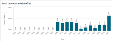
I have a percentage bar chart that shows the contribution of an employee to the number of courses all employees have taken. I want to only show the years on my chart where an employee's contribution is bigger than 0% (in other words, show only the years where he has taken any courses).
I want to show this across different charts (A chart with the total hours of courses the employee has taken and a chart with the percentage of hours that employee has contributed to the company)
How can I accomplish this?
Here's my chart when an employee is selected:
Here's the expression for the bar height:
=(Sum({$} Aggr(Count({$} distinct [Nome Evento]), [Nome do servidor], [Data.autoCalendar.Year]))) / (Sum({1} Aggr(Count({1} distinct [Nome Evento]), [Nome do servidor], [Data.autoCalendar.Year])))
Please let me know if there's any important information missing from this post. Thank you in advance.
----
Edit:
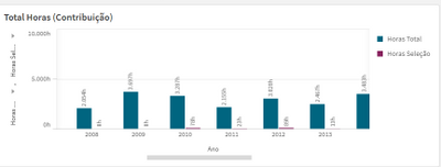
Unchecking the "Include Zero Value" in the Add On tab worked for the first chart. But I have a second chart with two bars:
Here's the expression for the blue bar:
(Sum({1} Aggr(Sum({1<[Nome Evento] =- {'null'}>} [Carga Horária]), [Nome Evento], [Nome do servidor], [Data.autoCalendar.Year])))
Here's the expression for the purple bar:
(Sum({$} Aggr(Sum({$<[Nome Evento] =- {'null'}>} [Carga Horária]), [Nome Evento], [Nome do servidor], [Data.autoCalendar.Year])))
I only want to display the years where the value of the purple bar is different from 0.
- Mark as New
- Bookmark
- Subscribe
- Mute
- Subscribe to RSS Feed
- Permalink
- Report Inappropriate Content
Hi,
Did you try to uncheck 'Include Zero Values' option under the data handling tab?
- Mark as New
- Bookmark
- Subscribe
- Mute
- Subscribe to RSS Feed
- Permalink
- Report Inappropriate Content
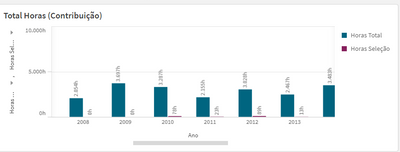
It worked for the first chart. But I have a second chart with two bars:
Here's the expression for the blue bar:
(Sum({1} Aggr(Sum({1<[Nome Evento] =- {'null'}>} [Carga Horária]), [Nome Evento], [Nome do servidor], [Data.autoCalendar.Year])))
Here's the expression for the purple bar:
(Sum({$} Aggr(Sum({$<[Nome Evento] =- {'null'}>} [Carga Horária]), [Nome Evento], [Nome do servidor], [Data.autoCalendar.Year])))
I only want to display the years where the value of the purple bar is different from 0.


