Unlock a world of possibilities! Login now and discover the exclusive benefits awaiting you.
- Qlik Community
- :
- Forums
- :
- Analytics
- :
- New to Qlik Analytics
- :
- Stacked bar chart not working properly - all parts...
- Subscribe to RSS Feed
- Mark Topic as New
- Mark Topic as Read
- Float this Topic for Current User
- Bookmark
- Subscribe
- Mute
- Printer Friendly Page
- Mark as New
- Bookmark
- Subscribe
- Mute
- Subscribe to RSS Feed
- Permalink
- Report Inappropriate Content
Stacked bar chart not working properly - all parts are equal
Hello everybody,
I am new to Qlik Sense and set analysis and I came across a problem I can't solve. I created two variables for sales in fiscal year 2014 and fiscal year 2015 which are calculated using set analysis from three tables:
varFY14 = sum({<[PY.Year]={14},Category={LICENSING},Type*={AO,RN}>}[PY.Price]) + sum({<[Bg.Year]={14},Category={LICENSING},Type*={AO,RN}>}[Bg.Price])
varFY15 = sum({<[Year]={15},Category={LICENSING},Type*={AO,RN}>}[Price]) + sum({<[PY.Year]={15},Category={LICENSING},Type*={AO,RN}>}[PY.Price]) + sum({<[Bg.Year]={15},Category={LICENSING},Type*={AO,RN}>}[Bg.Price])
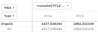
I got the correct results for variables but I can’t get the stacked bar chart to work. I use valuelist as dimension and the stacked dimension should be Type (AO or RN).
first_dimension = valuelist('FY14','FY15')
second_dimension = Type
measure = if(valuelist('FY14','FY15') = 'FY15',varFY15,if(valuelist('FY14','FY15') = 'FY14',varFY14))
First dimension works as expected but the "stacked Type dimension" does not. Both AO and RN parts shows same value (same percentage) and takes up equal space in the bar which doubles its height. I have also created a pivot table to see the values and when nothing is selected in filter pane, both AO and RN show same value which is equal to the full value of varFY14 and varFY15. When I click on the AO or RN part in the stacked bar chart, values in pivot table are recalculated to the correct value. Same goes for selecting AO or RN in filter pane - bar chart shows bar with correct height and pivot table shows the right value.
I am not sure if I am explaining this clearly so I made few screenshots (unfortunately I can not share the data file).
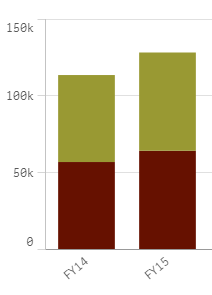
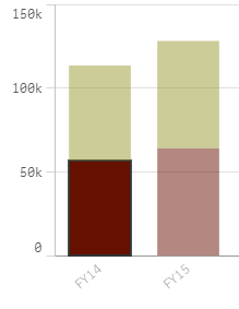
1) No filters are selected, both AO and RN are equal to varFY14/15 which is incorrect
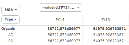
2) RN selected by clicking on green part of the chart, pivot table shows correct value for RN, hover on chart still shows 56k for RN
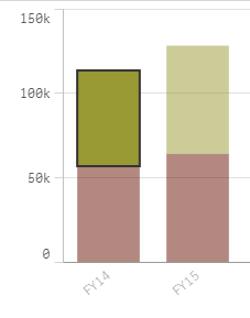
3) AO selected by clicking on red part of the chart, pivot table shows correct value for AO, hover on chart still shows 56k for AO
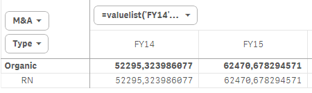
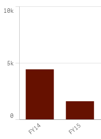
4) AO selected in filter pane, both bar chart and pivot table show correct value for AO and bar has correct height
How can I fix this and make Qlik Sense show the correct ratio and values in stacked bar char and pivot table? Or is this some native set analysis behaviour?
Thank you for your help,
Martin
Accepted Solutions
- Mark as New
- Bookmark
- Subscribe
- Mute
- Subscribe to RSS Feed
- Permalink
- Report Inappropriate Content
Hi Martin,
The calculated dimension created using the value list is causing the problem. When you add a Valuelist as a dimension, the expression should involve an if condition as follows:
If(valuelist('FY14','FY15') = 'FY14', <then calculation expression>, <else calculation expression>).
Otherwise, the expression is evaluated on the entire data resulting in same value for all the existing dimensions.
- Mark as New
- Bookmark
- Subscribe
- Mute
- Subscribe to RSS Feed
- Permalink
- Report Inappropriate Content
Martin,
Please post some sample data to test the calculations.
Thanks.
- Mark as New
- Bookmark
- Subscribe
- Mute
- Subscribe to RSS Feed
- Permalink
- Report Inappropriate Content
Hi Martin,
The calculated dimension created using the value list is causing the problem. When you add a Valuelist as a dimension, the expression should involve an if condition as follows:
If(valuelist('FY14','FY15') = 'FY14', <then calculation expression>, <else calculation expression>).
Otherwise, the expression is evaluated on the entire data resulting in same value for all the existing dimensions.
- Mark as New
- Bookmark
- Subscribe
- Mute
- Subscribe to RSS Feed
- Permalink
- Report Inappropriate Content
Thank you very much, this solved my problem.
Just to make it clear - there is no way I can use my variables in this situation to produce the results I want? If I want to use valuelist I always have to put expression directly into the measure? I use the same calculation in multiple charts/KPIs and this solution would make the code really bloated and difficult to maintain.