Unlock a world of possibilities! Login now and discover the exclusive benefits awaiting you.
- Qlik Community
- :
- Forums
- :
- Analytics
- :
- New to Qlik Analytics
- :
- T12 Calculaton / Trailing 12 Month Average in Qlik...
- Subscribe to RSS Feed
- Mark Topic as New
- Mark Topic as Read
- Float this Topic for Current User
- Bookmark
- Subscribe
- Mute
- Printer Friendly Page
- Mark as New
- Bookmark
- Subscribe
- Mute
- Subscribe to RSS Feed
- Permalink
- Report Inappropriate Content
T12 Calculaton / Trailing 12 Month Average in Qlik Sense
I am trying to figure out how to use Qlik Sense to do a T12 calculation
Trying to write the express in Qlik to go from the data set (on the left) to the T12 average per month (on the right)
In Excel, the T12 formula is effectively sum(Month1:Month12)/12.
Any suggestions?
| DATA SET | Trailing 12 Months (T12) | ||||||
| Month | Product | Sales $ | Qty | Month | Product | T12 Avg $ | T12 Avg Qty |
| 1/31/2016 | TV | $ 525,000 | 1,500 | 12/31/2016 | TV | $ 1,556,041.67 | 4,446 |
| 2/29/2016 | TV | $ 1,225,000 | 3,500 | 1/31/2017 | TV | $ 1,614,375.00 | 4,613 |
| 3/31/2016 | TV | $ 595,000 | 1,700 | 2/28/2017 | TV | $ 1,585,208.33 | 4,529 |
| 4/30/2016 | TV | $ 700,000 | 2,000 | 3/31/2017 | TV | $ 1,666,875.00 | 4,763 |
| 5/31/2016 | TV | $ 1,750,000 | 5,000 | 4/30/2017 | TV | $ 1,739,791.67 | 4,971 |
| 6/30/2016 | TV | $ 1,050,000 | 3,000 | 5/31/2017 | TV | $ 1,696,041.67 | 4,846 |
| 7/31/2016 | TV | $ 1,575,000 | 4,500 | 12/31/2016 | Monitor | $ 555,833.33 | 5,558 |
| 8/31/2016 | TV | $ 2,625,000 | 7,500 | 1/31/2017 | Monitor | $ 568,333.33 | 5,683 |
| 9/30/2016 | TV | $ 2,975,000 | 8,500 | 2/28/2017 | Monitor | $ 560,000.00 | 5,600 |
| 10/31/2016 | TV | $ 2,852,500 | 8,150 | 3/31/2017 | Monitor | $ 542,500.00 | 5,425 |
| 11/30/2016 | TV | $ 1,225,000 | 3,500 | 4/30/2017 | Monitor | $ 578,333.33 | 5,783 |
| 12/31/2016 | TV | $ 1,575,000 | 4,500 | 5/31/2017 | Monitor | $ 563,750.00 | 5,638 |
| 1/31/2017 | TV | $ 1,225,000 | 3,500 | ||||
| 2/28/2017 | TV | $ 875,000 | 2,500 | ||||
| 3/31/2017 | TV | $ 1,575,000 | 4,500 | ||||
| 4/30/2017 | TV | $ 1,575,000 | 4,500 | ||||
| 5/30/2017 | TV | $ 1,225,000 | 3,500 | ||||
| 1/31/2016 | Monitor | $ 200,000 | 2,000 | ||||
| 2/29/2016 | Monitor | $ 350,000 | 3,500 | ||||
| 3/31/2016 | Monitor | $ 410,000 | 4,100 | ||||
| 4/30/2016 | Monitor | $ 320,000 | 3,200 | ||||
| 5/31/2016 | Monitor | $ 675,000 | 6,750 | ||||
| 6/30/2016 | Monitor | $ 850,000 | 8,500 | ||||
| 7/31/2016 | Monitor | $ 950,000 | 9,500 | ||||
| 8/31/2016 | Monitor | $ 750,000 | 7,500 | ||||
| 9/30/2016 | Monitor | $ 350,000 | 3,500 | ||||
| 10/31/2016 | Monitor | $ 970,000 | 9,700 | ||||
| 11/30/2016 | Monitor | $ 505,000 | 5,050 | ||||
| 12/31/2016 | Monitor | $ 340,000 | 3,400 | ||||
| 1/31/2017 | Monitor | $ 350,000 | 3,500 | ||||
| 2/28/2017 | Monitor | $ 250,000 | 2,500 | ||||
| 3/31/2017 | Monitor | $ 200,000 | 2,000 | ||||
| 4/30/2017 | Monitor | $ 750,000 | 7,500 | ||||
| 5/30/2017 | Monitor | $ 500,000 | 5,000 | ||||
- Mark as New
- Bookmark
- Subscribe
- Mute
- Subscribe to RSS Feed
- Permalink
- Report Inappropriate Content
try something like:
rangeavg(above(sum(Sales),0,12))
--> but you must not change the sorting...
- Mark as New
- Bookmark
- Subscribe
- Mute
- Subscribe to RSS Feed
- Permalink
- Report Inappropriate Content
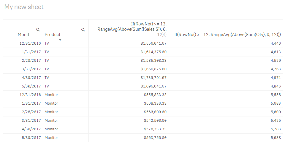
May be like attached
If(RowNo() >= 12, RangeAvg(Above(Sum([Sales $]), 0, 12)))
If(RowNo() >= 12, RangeAvg(Above(Sum(Qty), 0, 12)))
- Mark as New
- Bookmark
- Subscribe
- Mute
- Subscribe to RSS Feed
- Permalink
- Report Inappropriate Content
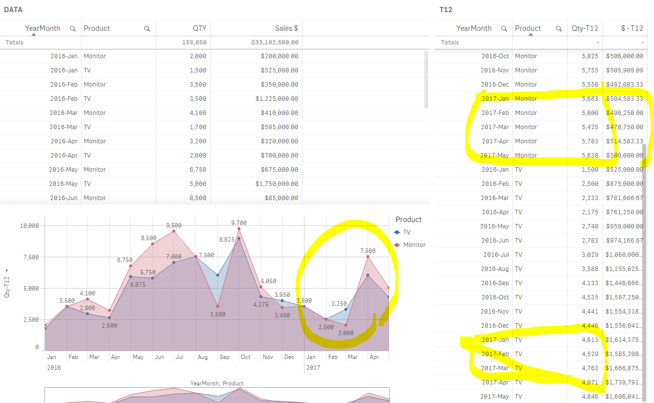
Thanks for the tip. When I did it in table format, it worked as you described if I sort it based on chronological order.
However, when I tried to convert it to Line Graph, the numbers seem to be completely different.
I need to show them in the line or bar graph so that we can spot the trending of each product.
Is there a way to present the results correctly in line or bar graph?
- Mark as New
- Bookmark
- Subscribe
- Mute
- Subscribe to RSS Feed
- Permalink
- Report Inappropriate Content
This works. Thanks. However, how to you show it properly in the sequential order (chronological) on the line graph?
- Mark as New
- Bookmark
- Subscribe
- Mute
- Subscribe to RSS Feed
- Permalink
- Report Inappropriate Content
May be give this a try
Sum(Aggr(If(RowNo() >= 12, RangeAvg(Above(Sum(Qty), 0, 12))), Product, (Month,(NUMERIC))))
- Mark as New
- Bookmark
- Subscribe
- Mute
- Subscribe to RSS Feed
- Permalink
- Report Inappropriate Content
...use sortable aggr()
Running totals per dimension (RangeSum(), sortable Aggr()...)