Unlock a world of possibilities! Login now and discover the exclusive benefits awaiting you.
- Qlik Community
- :
- Forums
- :
- Analytics
- :
- New to Qlik Analytics
- :
- User selected dimension
- Subscribe to RSS Feed
- Mark Topic as New
- Mark Topic as Read
- Float this Topic for Current User
- Bookmark
- Subscribe
- Mute
- Printer Friendly Page
- Mark as New
- Bookmark
- Subscribe
- Mute
- Subscribe to RSS Feed
- Permalink
- Report Inappropriate Content
User selected dimension
Hi,
Is it possible to let the user decide which dimension to show in a visualization?
I have a combo chart with two axes with lines representing two different KPIs. What I want to do is to let the user choose which KPI they want to compare by clicking on a filter view or dropdown or similar. If not, is there some other pattern to visualize this? There will be 2^2 different combinaions of kpis to compare so it's not feasible to create different combo charts for every one of them.
Thanks
Viktor
- « Previous Replies
-
- 1
- 2
- Next Replies »
Accepted Solutions
- Mark as New
- Bookmark
- Subscribe
- Mute
- Subscribe to RSS Feed
- Permalink
- Report Inappropriate Content
Yes it can probably be done.
I've done the same thing but with a line chart with a single line in it.
The user can select one of several metrics from a list to the left, and that metrics is then shown in the line chart.
We also set up the dimension (x-axis) of the chart to be driven dynamically, specifically it is possible to choose whether months or individual dates should be shown horizontally.
Some tricks are needed to achieve the above though, don't think you can do it with QS out of the box.
We used two different extensions from Qlik Branch.
1. CVL Dimenlist is used to drive the dynamic dimension
2. Qlik Sense Option List is used to drive the dynamic changing of metrics
You need to couple the above extensions with some inline tables where you define the metric names and their associated formulas, as well as some IF statements in the expressions for the chart measures.
I know... a sample app would be useful. Too busy right now, hopefully the above will get you started in the right direction.
/Göran
- Mark as New
- Bookmark
- Subscribe
- Mute
- Subscribe to RSS Feed
- Permalink
- Report Inappropriate Content
Hi,
you can do that.
please see the attachment.
see in Tab Reports.
BR
Ariel
- Mark as New
- Bookmark
- Subscribe
- Mute
- Subscribe to RSS Feed
- Permalink
- Report Inappropriate Content
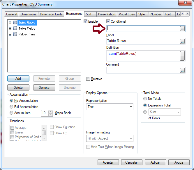
You could enable or disable the expressions representing thouse KPI's. To do this you could add buttons for each one of them and enable the expressions on conditions of thouse buttons being clicked.

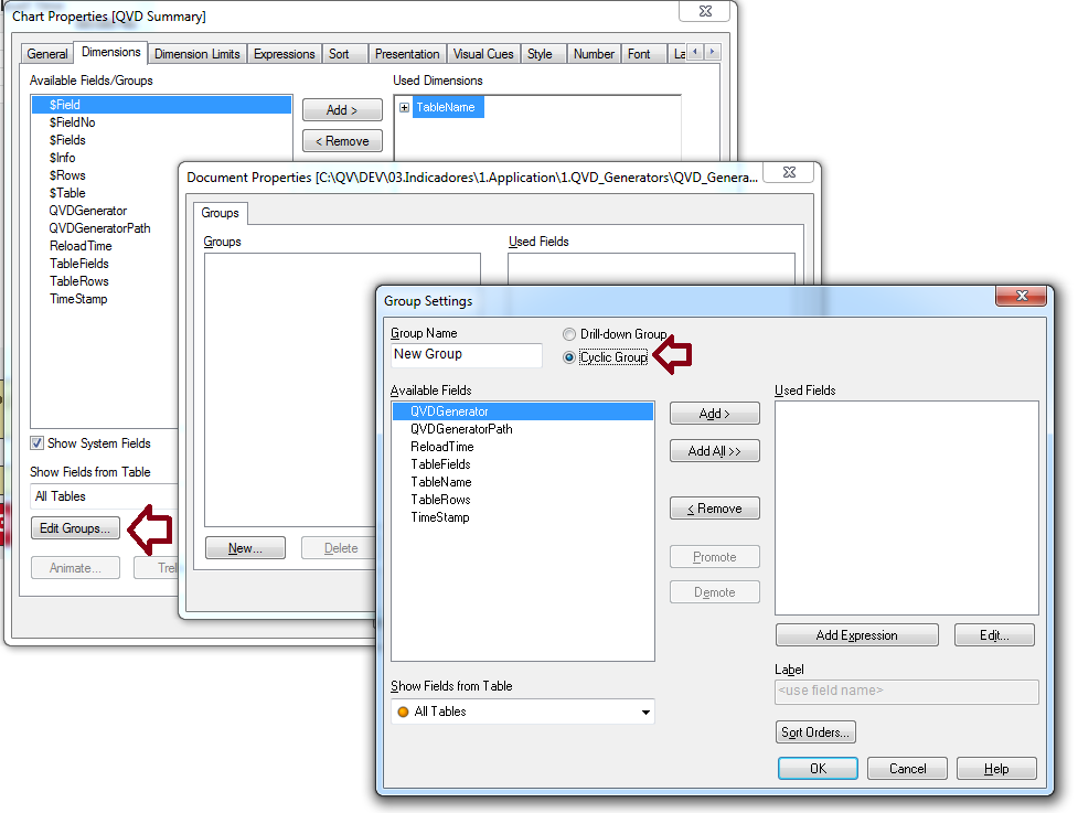
If you want to change what each axis represents, you could use cyclic groups to cycle arrond different dimensions:

- Mark as New
- Bookmark
- Subscribe
- Mute
- Subscribe to RSS Feed
- Permalink
- Report Inappropriate Content
Ariel is right. If you need more info, it´s called "Adhoc" reporting or dimensions.
Regards,
Angel
- Mark as New
- Bookmark
- Subscribe
- Mute
- Subscribe to RSS Feed
- Permalink
- Report Inappropriate Content
Thanks for the reply,
I should have been more clear. I'm using Qlik Sense. Not Qlik View. Is it still possible?
/Viktor
- Mark as New
- Bookmark
- Subscribe
- Mute
- Subscribe to RSS Feed
- Permalink
- Report Inappropriate Content
Hi,
In QlikSense if you have Edit permission then user can drag the required dimension and measures into the charts.
Regards,
Jagan.
- Mark as New
- Bookmark
- Subscribe
- Mute
- Subscribe to RSS Feed
- Permalink
- Report Inappropriate Content
Hi,
Thanks for the reply.
We want to avoid using the edit functionalitty for this use case though, since we will deploy this app to be used by several users, and letting everyone editing the app on the fly might create some confusion, dont you think?
- Mark as New
- Bookmark
- Subscribe
- Mute
- Subscribe to RSS Feed
- Permalink
- Report Inappropriate Content
Hi,
LOAD one table with Measures like Sales, Gross margin, Gross margin%, and use this expression in chart
=Pick(Match(Only(Measure), 'Sales', 'Gross margin', 'Gross margin%'), Sum(Sales),, Sum(Sales) - Sum(CostPrice), Sum(Sales)/Sum(CostPrice))
Hope this helps you.
Regards,
Jagan.
- Mark as New
- Bookmark
- Subscribe
- Mute
- Subscribe to RSS Feed
- Permalink
- Report Inappropriate Content
Yes it can probably be done.
I've done the same thing but with a line chart with a single line in it.
The user can select one of several metrics from a list to the left, and that metrics is then shown in the line chart.
We also set up the dimension (x-axis) of the chart to be driven dynamically, specifically it is possible to choose whether months or individual dates should be shown horizontally.
Some tricks are needed to achieve the above though, don't think you can do it with QS out of the box.
We used two different extensions from Qlik Branch.
1. CVL Dimenlist is used to drive the dynamic dimension
2. Qlik Sense Option List is used to drive the dynamic changing of metrics
You need to couple the above extensions with some inline tables where you define the metric names and their associated formulas, as well as some IF statements in the expressions for the chart measures.
I know... a sample app would be useful. Too busy right now, hopefully the above will get you started in the right direction.
/Göran
- Mark as New
- Bookmark
- Subscribe
- Mute
- Subscribe to RSS Feed
- Permalink
- Report Inappropriate Content
Thanks, I'll have a look at these extensions (and yes, a sample app would be great)!
- « Previous Replies
-
- 1
- 2
- Next Replies »