Unlock a world of possibilities! Login now and discover the exclusive benefits awaiting you.
- Qlik Community
- :
- Forums
- :
- Analytics
- :
- New to Qlik Analytics
- :
- Visualizations with two tables
- Subscribe to RSS Feed
- Mark Topic as New
- Mark Topic as Read
- Float this Topic for Current User
- Bookmark
- Subscribe
- Mute
- Printer Friendly Page
- Mark as New
- Bookmark
- Subscribe
- Mute
- Subscribe to RSS Feed
- Permalink
- Report Inappropriate Content
Visualizations with two tables
Hi, this question is probably simple, but I can't seem to find any answers to it online.
I'm doing visualizations on a Data Warehouse that contains fact tables.
Each fact table consists of 3 dimensions (IDs that are connected to their respective tables) and 2 measures.
To make it simple I'll give an example:
I have a fact table about deliveries. Each delivery has a few dimensions, one is "Zone" (Europe, Asia, Africa, America, etc.).
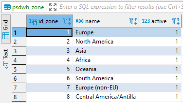
What this means is that for each delivery there a field that contains id_zone that links to a zones table containing all info about the zones.
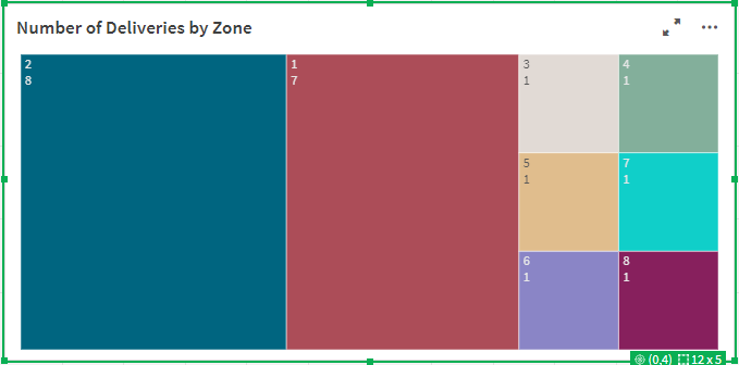
The visualization I want to do is very simple: I want to create a treemap chart of all the different zones and how many deliveries were made to each of them.
This is very simple to do. I just put id_zone as a Dimension, and count(id_zone) as a Measure. But the resulting chart shows the IDs of the zones as the labels, not their actual names. The actual names are contained in the zones table.
I want to somehow replaces the ID with their corresponding names, but I can't seem to do it.
I've provided screenshots of both tables to make it more understandable. Thanks!
The current visualization:
Deliveries table:
Zones table:
- Subscribe by Topic:
-
beginner
-
beginner help
-
Data Warehouse
-
Fact tables
-
Visualization
Accepted Solutions
- Mark as New
- Bookmark
- Subscribe
- Mute
- Subscribe to RSS Feed
- Permalink
- Report Inappropriate Content
Load the Zones tables into Qlik as well. Use "name" as your dimension. Your measure should then be Count(id_delivery) as you don't want to be counting a key field.
-Rob
- Mark as New
- Bookmark
- Subscribe
- Mute
- Subscribe to RSS Feed
- Permalink
- Report Inappropriate Content
Load the Zones tables into Qlik as well. Use "name" as your dimension. Your measure should then be Count(id_delivery) as you don't want to be counting a key field.
-Rob
- Mark as New
- Bookmark
- Subscribe
- Mute
- Subscribe to RSS Feed
- Permalink
- Report Inappropriate Content
Worked like a charm, thanks Rob!


