- Mark as New
- Bookmark
- Subscribe
- Mute
- Subscribe to RSS Feed
- Permalink
- Report Inappropriate Content
Y-axis duration negative values
Hi guys,
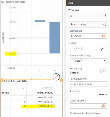
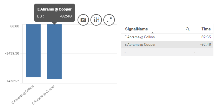
When I represent positive duration values on a bar chart, the y-axis show a reasonable range (from 0 to 17 seconds). However, when the values to represent are negative, that same chart shows a range from 0 to 1440 negative minutes.
Any idea of why this behavior? I expected a range between 0 and -17 seconds.
Thanks
The negative range:
- Tags:
- bar chart
- Mark as New
- Bookmark
- Subscribe
- Mute
- Subscribe to RSS Feed
- Permalink
- Report Inappropriate Content
Hi,
Make sure your expression format is "duration", but not "date"/"time". (Tested on QS Feb2019)
Hope this helps.
//Andrei
- Mark as New
- Bookmark
- Subscribe
- Mute
- Subscribe to RSS Feed
- Permalink
- Report Inappropriate Content
Thanks Andrei.
I've changed it from Auto to Duration, but I still get the same result.
- Mark as New
- Bookmark
- Subscribe
- Mute
- Subscribe to RSS Feed
- Permalink
- Report Inappropriate Content
When the result is positive, it works fine. Also, the actual values are OK, the problem in in the y-axis.
- Mark as New
- Bookmark
- Subscribe
- Mute
- Subscribe to RSS Feed
- Permalink
- Report Inappropriate Content
To check whether the issue is in data or in QS itself, do the following:
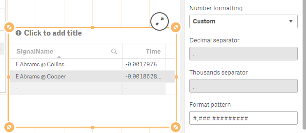
1. Create a table with exactly the same dimensions and measures
2. In measures change the formatting to NUMBER with format like #,###.#########
3. Check if you have values Duration < -1
See example below:
Basically 1440 minutes in a day which is equal to 1 in Qlik (as well as in Excel), so you might need to get rid of date part, or be quite careful with subtraction two dates.
Hope this helps
//Andrei
- Mark as New
- Bookmark
- Subscribe
- Mute
- Subscribe to RSS Feed
- Permalink
- Report Inappropriate Content
Hi Andrei,
Thanks for your response. I've followed your advice and I created a table with same dimension and measure. The values I see in the table are the ones I'd like to have in the y-axis.
I checked what you recommended and I don't have values < -1. Strange, right?
- Mark as New
- Bookmark
- Subscribe
- Mute
- Subscribe to RSS Feed
- Permalink
- Report Inappropriate Content
Hi,
That's strange indeed, I can't replicate the issue on my Feb2019 instance though. Just in case check if ComboChart behaves the same as Bar chart - if not use it, if so you can log a support ticket, however if they fixed this in the latest version, the only advice you would get is "to upgrade QS to the latest version"
//Andrei
- Mark as New
- Bookmark
- Subscribe
- Mute
- Subscribe to RSS Feed
- Permalink
- Report Inappropriate Content
Hi Andrei, I see what you mean. Out of curiosity I'll try it in the Feb 2019 version when I have a chance.
In the meantime, I'm using "Value labels" and hiding the y-axis.
Thanks for following up!
Juan


