Unlock a world of possibilities! Login now and discover the exclusive benefits awaiting you.
- Qlik Community
- :
- Forums
- :
- Analytics
- :
- New to Qlik Analytics
- :
- timeline per hour in distribution plot
- Subscribe to RSS Feed
- Mark Topic as New
- Mark Topic as Read
- Float this Topic for Current User
- Bookmark
- Subscribe
- Mute
- Printer Friendly Page
- Mark as New
- Bookmark
- Subscribe
- Mute
- Subscribe to RSS Feed
- Permalink
- Report Inappropriate Content
timeline per hour in distribution plot
I have a table with the number of announcements of television channels and I have the hour (only the number without format, for example 5).
I want to make a timeline in a distribution diagram, but I can not put the time on the x-axis (measure), it only allows me to sum or count. I want the graph to separate it by channel and that the time is fixed, not that it adds up the hours. Thank you.
Accepted Solutions
- Mark as New
- Bookmark
- Subscribe
- Mute
- Subscribe to RSS Feed
- Permalink
- Report Inappropriate Content
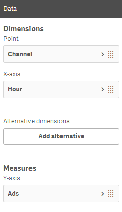
I think I understand what you are trying to show. I have used some dummy data with 2 channels and these settings:
- Mark as New
- Bookmark
- Subscribe
- Mute
- Subscribe to RSS Feed
- Permalink
- Report Inappropriate Content
I think I understand what you are trying to show. I have used some dummy data with 2 channels and these settings:
- Mark as New
- Bookmark
- Subscribe
- Mute
- Subscribe to RSS Feed
- Permalink
- Report Inappropriate Content
is a good idea to see ads by quantity, but I want to see the appearance of the ads independent of the quantity, this is for see the progress.
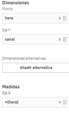
I found a solution for this, attach images.
will there be any way to add the television program variable following this same logic.
Thanks.


