Unlock a world of possibilities! Login now and discover the exclusive benefits awaiting you.
- Qlik Community
- :
- Forums
- :
- Analytics
- :
- New to Qlik Analytics
- :
- Re: 'top X% of customers are responsible for Y% of...
- Subscribe to RSS Feed
- Mark Topic as New
- Mark Topic as Read
- Float this Topic for Current User
- Bookmark
- Subscribe
- Mute
- Printer Friendly Page
- Mark as New
- Bookmark
- Subscribe
- Mute
- Subscribe to RSS Feed
- Permalink
- Report Inappropriate Content
'top X% of customers are responsible for Y% of total sales' - how we create one line chart and derive such output?
Let me provide some dummy data -
| Tran ID | Cust ID | Sales |
| 260931145 | AA | 5840 |
| 315033323 | CC | 5029 |
| 275618319 | BB | 2396 |
| 330493554 | AA | 5240 |
| 140614679 | CC | 5467 |
| 282028508 | AA | 4480 |
| 297152365 | CC | 2458 |
| 285995215 | AA | 1255 |
| 162141627 | DD | 4421 |
| 170163026 | AA | 401 |
| 186137589 | DD | 1678 |
| 243420751 | BB | 3368 |
| 137864261 | AA | 5722 |
| 306808185 | DD | 3058 |
| 213971526 | BB | 3214 |
| 147063316 | DD | 3703 |
| 284114268 | EE | 2146 |
| 139492351 | BB | 6394 |
| 277633751 | AA | 5799 |
from this data we are to create a Bar chart that can give us below information-
top X% of customers are responsible for Y% of total sales.
Please note top X% Customers will be calculated on 'Sum of Transaction Amount'.

top 10% customer by sales amount is responsible for 60%total sales and bottom 30% customers make only 5% of total sale amount,
Please note we can only use "Data Manager".
Accepted Solutions
- Mark as New
- Bookmark
- Subscribe
- Mute
- Subscribe to RSS Feed
- Permalink
- Report Inappropriate Content
advance apologies, I am not familiar with data manager. so I tried my hand at the front end to get the info required in a chart. sorry if this does not help in any way.

- Mark as New
- Bookmark
- Subscribe
- Mute
- Subscribe to RSS Feed
- Permalink
- Report Inappropriate Content
advance apologies, I am not familiar with data manager. so I tried my hand at the front end to get the info required in a chart. sorry if this does not help in any way.
- Mark as New
- Bookmark
- Subscribe
- Mute
- Subscribe to RSS Feed
- Permalink
- Report Inappropriate Content
Thanks a lot for your reply.
1> I was following your process but was facing issue with sorting, we should sort the rows on rank(sum(sale)),
but it was always taking CustID for sorting. Tried changing the parameters in Sorting tabs but no use.
2> My final target is to feed the data into one line chart or scatter plot.
how to do that?
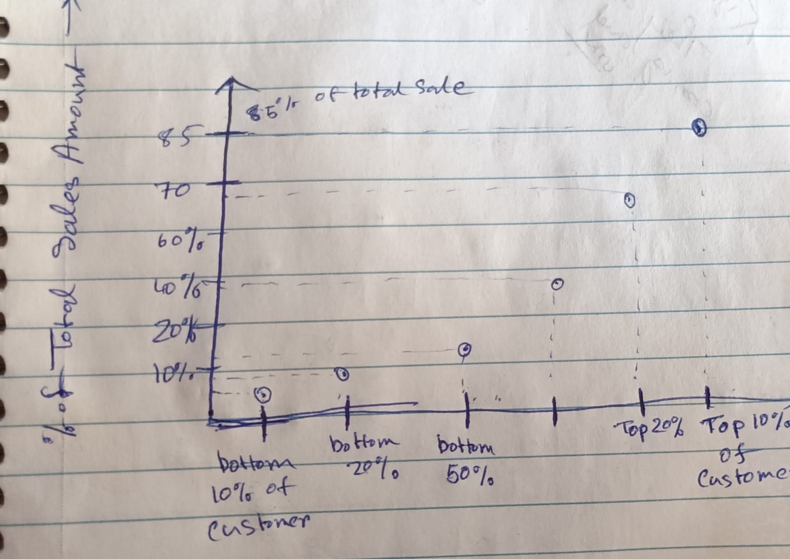
please check the file attached I have provided what output I am looking.
- Mark as New
- Bookmark
- Subscribe
- Mute
- Subscribe to RSS Feed
- Permalink
- Report Inappropriate Content
swapping CustID & ranking columns around could fix the first issue.
I have not been able to figure out the chart yet.. maybe adding rank into the chart and making it invisible (colour it white) might help.
- Mark as New
- Bookmark
- Subscribe
- Mute
- Subscribe to RSS Feed
- Permalink
- Report Inappropriate Content
I have not worked with variables in qlik. but that may work, if you can store each percentage of customer % in a variable and another variable for sales % chart might be feasible?