Unlock a world of possibilities! Login now and discover the exclusive benefits awaiting you.
- Qlik Community
- :
- Forums
- :
- Analytics
- :
- New to Qlik Analytics
- :
- Re: Bar Chart - differentiated by colour or as sin...
- Subscribe to RSS Feed
- Mark Topic as New
- Mark Topic as Read
- Float this Topic for Current User
- Bookmark
- Subscribe
- Mute
- Printer Friendly Page
- Mark as New
- Bookmark
- Subscribe
- Mute
- Subscribe to RSS Feed
- Permalink
- Report Inappropriate Content
Bar Chart - differentiated by colour or as single bars
Hi
I’m a newcomer to Qlik Sense and I have some questions regarding how to display multiple items in a bar chart, differentiated by colour in a bar chart or as single bars in a bar chart.
I would like to display and differentiate development wells based on the purpose of the wells – injection, observation and production. For now, I can only display them all tougher in a bar chart, but I would like to display them as stacked bars differentiated by colour or by single bars where the wells are stacked in single bars.
Thanks
Cheers
Helge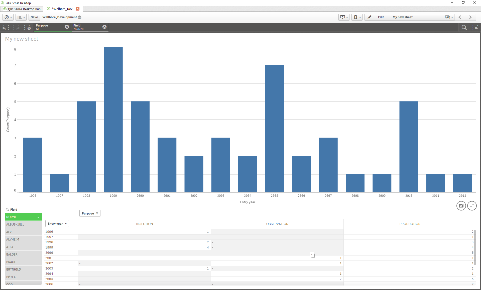
Accepted Solutions
- Mark as New
- Bookmark
- Subscribe
- Mute
- Subscribe to RSS Feed
- Permalink
- Report Inappropriate Content
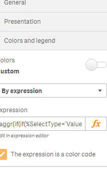
Try adding purpose as a dimension to the bar chart to differentiate the counts based on well purpose. Under appearance select the 'Colors by dimension' as well as the 'Stacked' option to change appearance of the bar chart.
Appearance --> Presentation --> Stacked
Appearance --> Colors and Legends --> Custom off --> By dimension
Hope this helps
- Mark as New
- Bookmark
- Subscribe
- Mute
- Subscribe to RSS Feed
- Permalink
- Report Inappropriate Content
Edit the chart and go to colors and legend. Turn off Custom Color button.
You then have several options for colors. You can choose to color by expression and build and expression that assigns the color you want based on the type of well for example. Or have Qlik assign the colors.
- Mark as New
- Bookmark
- Subscribe
- Mute
- Subscribe to RSS Feed
- Permalink
- Report Inappropriate Content
Try adding purpose as a dimension to the bar chart to differentiate the counts based on well purpose. Under appearance select the 'Colors by dimension' as well as the 'Stacked' option to change appearance of the bar chart.
Appearance --> Presentation --> Stacked
Appearance --> Colors and Legends --> Custom off --> By dimension
Hope this helps
- Mark as New
- Bookmark
- Subscribe
- Mute
- Subscribe to RSS Feed
- Permalink
- Report Inappropriate Content
Hi,
Try this and you can set the colour here.
- Mark as New
- Bookmark
- Subscribe
- Mute
- Subscribe to RSS Feed
- Permalink
- Report Inappropriate Content
Thanks Ugonna! Now the wells are organized the way i want them to!
Thanks allot for the help all!
cheers
- Mark as New
- Bookmark
- Subscribe
- Mute
- Subscribe to RSS Feed
- Permalink
- Report Inappropriate Content
glad I could help!