Unlock a world of possibilities! Login now and discover the exclusive benefits awaiting you.
- Qlik Community
- :
- Forums
- :
- Analytics
- :
- New to Qlik Analytics
- :
- Chart conditional colour formatting
- Subscribe to RSS Feed
- Mark Topic as New
- Mark Topic as Read
- Float this Topic for Current User
- Bookmark
- Subscribe
- Mute
- Printer Friendly Page
- Mark as New
- Bookmark
- Subscribe
- Mute
- Subscribe to RSS Feed
- Permalink
- Report Inappropriate Content
Chart conditional colour formatting
I am attempting to have a default bar chart coloured.
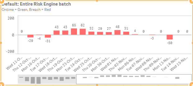
When a User initially opens the Dashboard, the SLA Entire Risk Engine batch details will appear and where minutes are negative, bars should be red and where minutes are positive bars should be green (will change colour for colour blind people another time).
The code works fine if I don't use a default selection but when I introduce a default selection the positive minutes red instead of green.
If((isnull(Milestone) AND Min({<System={'Source'},Milestone={'Entire Risk Engine batch'},Status={'Breach'}>} Minutes))<0,
rgb(255,110,110),
If((isnull(Milestone) AND Max({<System={'Source'},Milestone={'Entire Risk Engine batch'},Status={'Breach'}>} Minutes))>0,
Green(),
If(Min({<System={'Source'},Status={'Breach'}>} Minutes)<0,
rgb(255,110,110),
Green(),
)))
- « Previous Replies
- Next Replies »
- Mark as New
- Bookmark
- Subscribe
- Mute
- Subscribe to RSS Feed
- Permalink
- Report Inappropriate Content
sorry which formula did you use again?
- Mark as New
- Bookmark
- Subscribe
- Mute
- Subscribe to RSS Feed
- Permalink
- Report Inappropriate Content
if(If(isnull(Milestone),
Min({<System={'Source'},Milestone={'Entire Risk Engine batch'},isExclusion={0}>} Minutes),
Min({<System={'Source'},isExclusion={0}>} Minutes))<0,rgb(255,110,110),green())
for the color expression
and
= if (isExclusion=0 and Minutes<>0, date(Date, 'WWW DD-MMM-YY'))
for the Dimension field of your chart
- Mark as New
- Bookmark
- Subscribe
- Mute
- Subscribe to RSS Feed
- Permalink
- Report Inappropriate Content
apologies i am just back from breaking my hand and I have lost the actual code I used for the measure which is causing me grief. Can u please supply that.
- Mark as New
- Bookmark
- Subscribe
- Mute
- Subscribe to RSS Feed
- Permalink
- Report Inappropriate Content
Here is your original app with my changes in the one bar chart visualisation:
- Mark as New
- Bookmark
- Subscribe
- Mute
- Subscribe to RSS Feed
- Permalink
- Report Inappropriate Content
If that answers your Question please mark my answer as correct.
- Mark as New
- Bookmark
- Subscribe
- Mute
- Subscribe to RSS Feed
- Permalink
- Report Inappropriate Content
Thanks very much, dont know what I did wrong but you have it working wonderfully.
- « Previous Replies
- Next Replies »