Unlock a world of possibilities! Login now and discover the exclusive benefits awaiting you.
- Qlik Community
- :
- Forums
- :
- Analytics
- :
- New to Qlik Analytics
- :
- Re: Creating a scatter plot without a unique ID?
- Subscribe to RSS Feed
- Mark Topic as New
- Mark Topic as Read
- Float this Topic for Current User
- Bookmark
- Subscribe
- Mute
- Printer Friendly Page
- Mark as New
- Bookmark
- Subscribe
- Mute
- Subscribe to RSS Feed
- Permalink
- Report Inappropriate Content
Creating a scatter plot without a unique ID?
So I have some data where there are two or more y-axis values for the same x-axis value so I figured I would have to create a scatter plot for this. I have three columsn, one is ID, the other is AST and the third is Hepcidin.
I have a scatter plot and it works but I was wondering if there was anyway to get all the scatter plots to be the same color and not different (they are different due to the unique ID of each line of data)
Accepted Solutions
- Mark as New
- Bookmark
- Subscribe
- Mute
- Subscribe to RSS Feed
- Permalink
- Report Inappropriate Content
Hi,
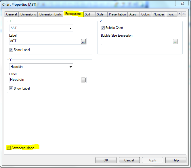
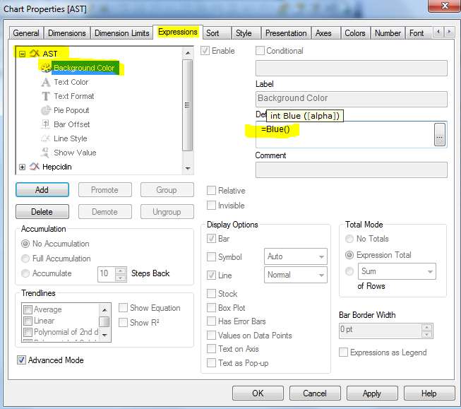
Just under the Chart Properties>Expressions
check the Advanced Mode, in the Detailed Expression Properties window, change the background color for the expressions AST and Hepcidin to the required color expression (ex: =RGB(192,192,192) or any standard color expressions like =LightBlue())
Attached the snapshots for reference.
The same chart by default will have same color for ID's when represented in QlikSense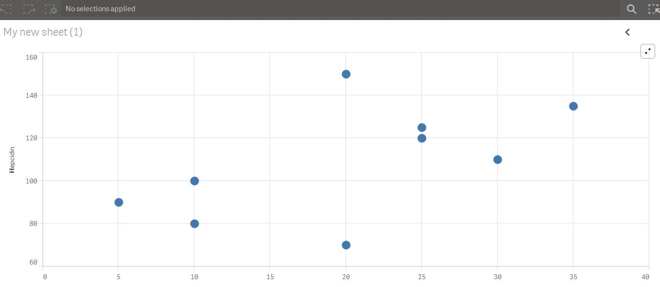
Thanks,
Sri
- Mark as New
- Bookmark
- Subscribe
- Mute
- Subscribe to RSS Feed
- Permalink
- Report Inappropriate Content
I'sorry because I can't see image
- Mark as New
- Bookmark
- Subscribe
- Mute
- Subscribe to RSS Feed
- Permalink
- Report Inappropriate Content
I reuploaded as a jpg.
- Mark as New
- Bookmark
- Subscribe
- Mute
- Subscribe to RSS Feed
- Permalink
- Report Inappropriate Content
attached propose a solution ¿?
- Mark as New
- Bookmark
- Subscribe
- Mute
- Subscribe to RSS Feed
- Permalink
- Report Inappropriate Content
I'm sorry but I have not bought QV yet (still have the personal version).
- Mark as New
- Bookmark
- Subscribe
- Mute
- Subscribe to RSS Feed
- Permalink
- Report Inappropriate Content
Hi,
Just under the Chart Properties>Expressions
check the Advanced Mode, in the Detailed Expression Properties window, change the background color for the expressions AST and Hepcidin to the required color expression (ex: =RGB(192,192,192) or any standard color expressions like =LightBlue())
Attached the snapshots for reference.
The same chart by default will have same color for ID's when represented in QlikSense
Thanks,
Sri
- Mark as New
- Bookmark
- Subscribe
- Mute
- Subscribe to RSS Feed
- Permalink
- Report Inappropriate Content
Is this for Qlik Sense Desktop or QlikView 11?
- Mark as New
- Bookmark
- Subscribe
- Mute
- Subscribe to RSS Feed
- Permalink
- Report Inappropriate Content
Is this for QlikView?
Screenshot above shows QlikView.
Thanks!
- Mark as New
- Bookmark
- Subscribe
- Mute
- Subscribe to RSS Feed
- Permalink
- Report Inappropriate Content
Worked perfectly thank you!