Unlock a world of possibilities! Login now and discover the exclusive benefits awaiting you.
- Qlik Community
- :
- Forums
- :
- Analytics
- :
- New to Qlik Analytics
- :
- Re: Donut Charts with multiple dimensions
- Subscribe to RSS Feed
- Mark Topic as New
- Mark Topic as Read
- Float this Topic for Current User
- Bookmark
- Subscribe
- Mute
- Printer Friendly Page
- Mark as New
- Bookmark
- Subscribe
- Mute
- Subscribe to RSS Feed
- Permalink
- Report Inappropriate Content
Donut Charts with multiple dimensions
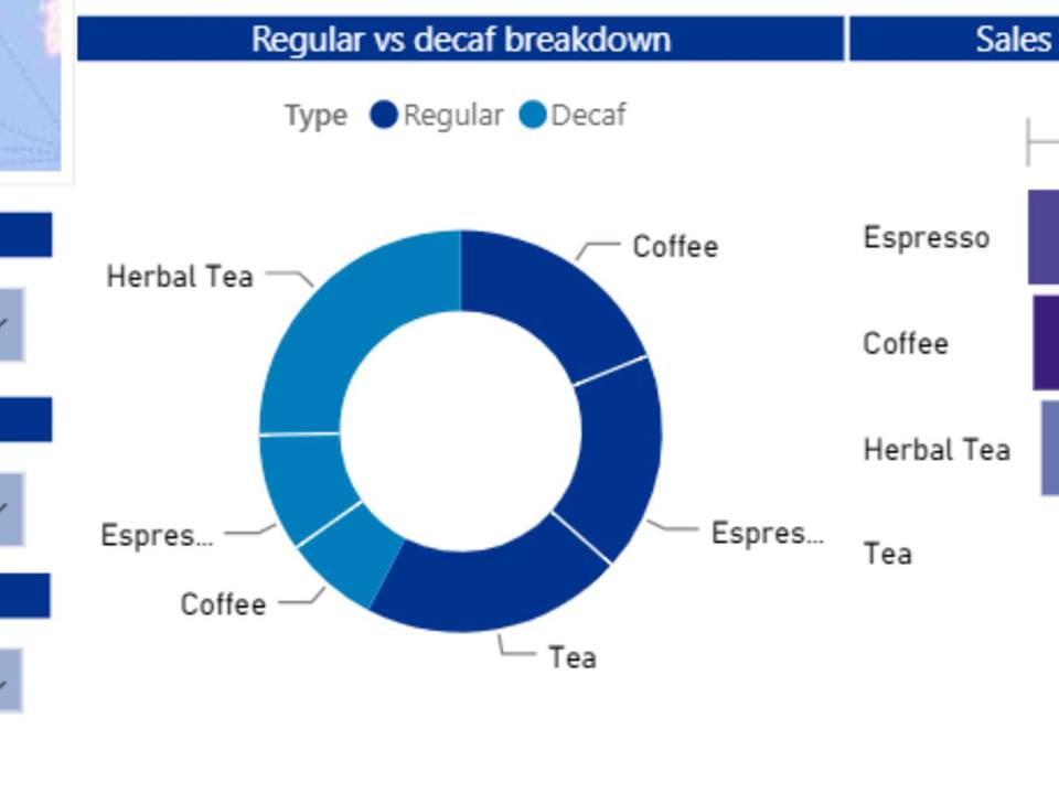
Hi, I've been trying to reproduce the donut chart below but without much success. Could you please advise as to what must be done?
I have Types (Regular and Decaf) and Product Types (Coffee etc). I wish to represent the same measure for both on a single donut as shown below.
Accepted Solutions
- Mark as New
- Bookmark
- Subscribe
- Mute
- Subscribe to RSS Feed
- Permalink
- Report Inappropriate Content
Hello everyone. I have figured out the answer. Thank you for your help and time though.
For anyone interested, you should create a new dimension under the Master List and type 'Type &[Product type]' in the field. Once created, you can edit the dimension to fit in the colours required (different shades of blue in my case) and from there, everything else is relatively easy to do.
Regards,
Arrow
- Mark as New
- Bookmark
- Subscribe
- Mute
- Subscribe to RSS Feed
- Permalink
- Report Inappropriate Content
talk is cheap, supply exceeds demand
- Mark as New
- Bookmark
- Subscribe
- Mute
- Subscribe to RSS Feed
- Permalink
- Report Inappropriate Content
- Mark as New
- Bookmark
- Subscribe
- Mute
- Subscribe to RSS Feed
- Permalink
- Report Inappropriate Content
See attached example
talk is cheap, supply exceeds demand
- Mark as New
- Bookmark
- Subscribe
- Mute
- Subscribe to RSS Feed
- Permalink
- Report Inappropriate Content
Hi! Thanks for the file but it actually contains a bar chart instead of the donut chart that I was looking for. Please advise accordingly.
- Mark as New
- Bookmark
- Subscribe
- Mute
- Subscribe to RSS Feed
- Permalink
- Report Inappropriate Content
i think you should try to create a single dimension from Type and Product Type, as per my understanding there only one dimension possible in pie charts
in qlikview without dimension and multiple expression pie chart was possible but not in qliksense
- Mark as New
- Bookmark
- Subscribe
- Mute
- Subscribe to RSS Feed
- Permalink
- Report Inappropriate Content
Hi,
by default visualization of pie chart it is only possible " to use a pie chart when you have a single data series with only positive values. In the pie chart, the dimensions form sectors of the measure value. You can include one measure and one dimension in a pie chart."
- Mark as New
- Bookmark
- Subscribe
- Mute
- Subscribe to RSS Feed
- Permalink
- Report Inappropriate Content
Ok, I attached an example from another discussion. The zip file I attached now should be the correct file.
talk is cheap, supply exceeds demand
- Mark as New
- Bookmark
- Subscribe
- Mute
- Subscribe to RSS Feed
- Permalink
- Report Inappropriate Content
Hello everyone. I have figured out the answer. Thank you for your help and time though.
For anyone interested, you should create a new dimension under the Master List and type 'Type &[Product type]' in the field. Once created, you can edit the dimension to fit in the colours required (different shades of blue in my case) and from there, everything else is relatively easy to do.
Regards,
Arrow