Unlock a world of possibilities! Login now and discover the exclusive benefits awaiting you.
- Qlik Community
- :
- Forums
- :
- Analytics
- :
- New to Qlik Analytics
- :
- Re: Double Pie Chart
- Subscribe to RSS Feed
- Mark Topic as New
- Mark Topic as Read
- Float this Topic for Current User
- Bookmark
- Subscribe
- Mute
- Printer Friendly Page
- Mark as New
- Bookmark
- Subscribe
- Mute
- Subscribe to RSS Feed
- Permalink
- Report Inappropriate Content
Double Pie Chart
Hi
can you tell me step by step how we can create the double pie chart in qilk sense App. please
- Mark as New
- Bookmark
- Subscribe
- Mute
- Subscribe to RSS Feed
- Permalink
- Report Inappropriate Content
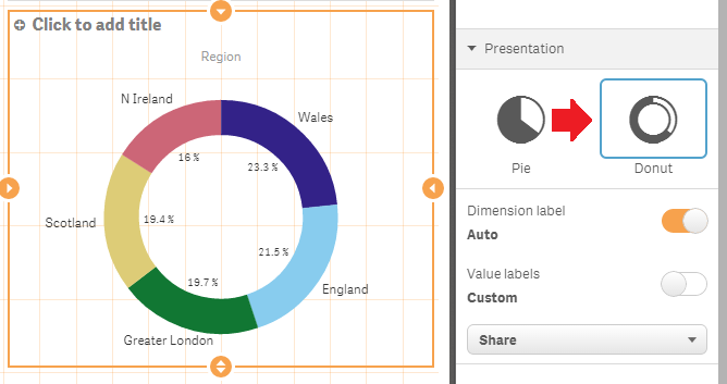
What is a 'Double Pie' chart? Do you mean the Donut style that can be selected under Presentation?
talk is cheap, supply exceeds demand
- Mark as New
- Bookmark
- Subscribe
- Mute
- Subscribe to RSS Feed
- Permalink
- Report Inappropriate Content

like double pie charts it possible in xls sheet but same thing I would like to see in qlik sense like how much product share in area it show in inner pie chart and how much we get the return from that area which is outer pie charts.
- Mark as New
- Bookmark
- Subscribe
- Mute
- Subscribe to RSS Feed
- Permalink
- Report Inappropriate Content
Well, that's not possible in Qlik Sense without an extension. If you want to create such a dysfunctional abomination you'll have to find (or create) an extension that can create such chart junk.
talk is cheap, supply exceeds demand
- Mark as New
- Bookmark
- Subscribe
- Mute
- Subscribe to RSS Feed
- Permalink
- Report Inappropriate Content
HI,
This type of chart is not possible in Qliksense, you have to write or find an extension for this.
Regards,
Jagan.
- Mark as New
- Bookmark
- Subscribe
- Mute
- Subscribe to RSS Feed
- Permalink
- Report Inappropriate Content
The nearest approach within qv (and without extensions) would be to overlap two pie-charts and adjust the visibility and color from various properties like title, border, legend and so on. But it would be not very flexible or look very beautiful.
Pie-charts with more than 5 - 6 values have a bad readability for users and with such a second level even more. It creates rather confusion than any added value. I suggest you looked for another kind of (inbuilt) visualization. Maybe a combination from various charts(-types) which form a logical line or a grid.
I think these books could be helpful, too:
QlikView for Developers Cookbook
Stephen Redmond
ISBN-13: 978-1782179733
Learning Qlikview Data Visualization
Karl Pover
ISBN-13: 978-1782179894
- Marcus
- Mark as New
- Bookmark
- Subscribe
- Mute
- Subscribe to RSS Feed
- Permalink
- Report Inappropriate Content
Perhaps this link can guide you to finding a suitable chart type? Introducing Qlik instead of Excel sometimes require that you challenge your habits and the ways you consume data. Why not do a could of different charts to present the same data and ask your end-users which they think is best?