Unlock a world of possibilities! Login now and discover the exclusive benefits awaiting you.
- Qlik Community
- :
- Forums
- :
- Analytics
- :
- New to Qlik Analytics
- :
- Graphing Rangesum with conditions
- Subscribe to RSS Feed
- Mark Topic as New
- Mark Topic as Read
- Float this Topic for Current User
- Bookmark
- Subscribe
- Mute
- Printer Friendly Page
- Mark as New
- Bookmark
- Subscribe
- Mute
- Subscribe to RSS Feed
- Permalink
- Report Inappropriate Content
Graphing Rangesum with conditions
Hi, I am trying to chart a rangesum function of my current daily sales compared to my previous year.
My function for the current day is:
RangeSum(Above(Total Count({<Date= {"$(=Max(Date))"}>}Sales), 0, RowNo()))
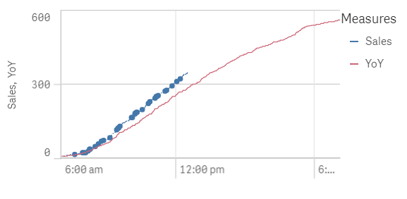
Chart:
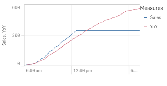
It works perfect except it plateaus at the current time instead of ending. I was wondering if there is a way to graph it with conditions like "time is less than or equals to reloadtime()". No matter what I do, it flattens at that time.
I'd prefer it if the blue line just ended when it reaches the most recent reloadtime
Thanks!
- Tags:
- rangesum()
- Mark as New
- Bookmark
- Subscribe
- Mute
- Subscribe to RSS Feed
- Permalink
- Report Inappropriate Content
How about this?
If(Count({<Date= {"$(=Max(Date))"}>}Sales) <> 0, RangeSum(Above(Total Count({<Date= {"$(=Max(Date))"}>}Sales), 0, RowNo())))
- Mark as New
- Bookmark
- Subscribe
- Mute
- Subscribe to RSS Feed
- Permalink
- Report Inappropriate Content
It sort of works. I don't want to ignore zeroes during the day. I just want to ignore them after the most recent reload time. I need that blue line to be a nice clean uninterrupted line
- Mark as New
- Bookmark
- Subscribe
- Mute
- Subscribe to RSS Feed
- Permalink
- Report Inappropriate Content
May be this then
If(TimeField < Frac(ReloadTime()), RangeSum(Above(Total Count({<Date= {"$(=Max(Date))"}>}Sales), 0, RowNo())))
- Mark as New
- Bookmark
- Subscribe
- Mute
- Subscribe to RSS Feed
- Permalink
- Report Inappropriate Content
Or
If(DateTimeField < ReloadTime(), RangeSum(Above(Total Count({<Date= {"$(=Max(Date))"}>}Sales), 0, RowNo())))
- Mark as New
- Bookmark
- Subscribe
- Mute
- Subscribe to RSS Feed
- Permalink
- Report Inappropriate Content
Sorry for not being able to respond.
When I try this, qlikSense freezes up. I had to delete the chart completely and remake it
- Mark as New
- Bookmark
- Subscribe
- Mute
- Subscribe to RSS Feed
- Permalink
- Report Inappropriate Content
Would you be able to share you app to test?