Unlock a world of possibilities! Login now and discover the exclusive benefits awaiting you.
- Qlik Community
- :
- Forums
- :
- Analytics
- :
- New to Qlik Analytics
- :
- How to create line chart with summed total line
- Subscribe to RSS Feed
- Mark Topic as New
- Mark Topic as Read
- Float this Topic for Current User
- Bookmark
- Subscribe
- Mute
- Printer Friendly Page
- Mark as New
- Bookmark
- Subscribe
- Mute
- Subscribe to RSS Feed
- Permalink
- Report Inappropriate Content
How to create line chart with summed total line
Hi,
Two quick questions from a new user here. If anyone is kind enough to help, I would greatly appreciate it if you can use as little QlikSense jargon as possible, I really get lost trying to use other resources for QlikSense support when the terminology is unfamiliar.
1)Trying to use Qlik Sense to create some very basic dashboards that mimic what we were doing in excel manually and I need some help. How would I add a third line to this chart that is a sum of Line 1 and Line 2? Data table is quite simple, it has date opened (We are using Year.month for this report's dimension), the type of complaint, and the organization that handled it.
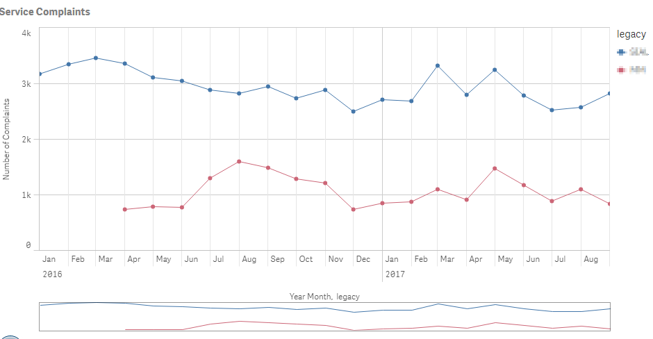
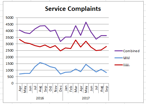
I am trying to make it look like this:
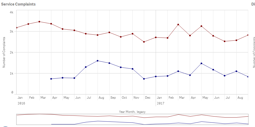
2) For odd reasons, I need to flip the colors so the top line is red and bottom line is blue. When I go into colors section of the chart, it seems there is no way to manually change the colors and that I need to use some sort of formula, so I am using a formula that is:
IF(legacy = 'APPL', Red(), Blue())
So the Legacy APPL should be the Red line and the other one would be blue. This formula works for my chart, the colors flip, but then my legend disappears and without the legend the chart is not really understandable.
Thanks for anyone who takes the time to read or reply to this, and please don't feel bad explaining anything to me like I am a 3 year old!
Cheers,
Accepted Solutions
- Mark as New
- Bookmark
- Subscribe
- Mute
- Subscribe to RSS Feed
- Permalink
- Report Inappropriate Content
For sum of Line 1 and Line 2:
Create another measure and use this expression:
Column(1) + Column(2) - This will simply summate the 2 measures and give you a 3rd measure.
- Mark as New
- Bookmark
- Subscribe
- Mute
- Subscribe to RSS Feed
- Permalink
- Report Inappropriate Content
For your 1st issue, create a new table in the script like this
LOAD * INLINE [
Dim
1
2
];
and then use this as your dimension
YearMonth
Pick(Dim, legacy, 'Combined')
Measure
What ever you are using today
Not sure about your 2nd issue
- Mark as New
- Bookmark
- Subscribe
- Mute
- Subscribe to RSS Feed
- Permalink
- Report Inappropriate Content
For sum of Line 1 and Line 2:
Create another measure and use this expression:
Column(1) + Column(2) - This will simply summate the 2 measures and give you a 3rd measure.
- Mark as New
- Bookmark
- Subscribe
- Mute
- Subscribe to RSS Feed
- Permalink
- Report Inappropriate Content
For 2nd issue - Coloring -
Add your expressions as Master Items - then go to edit and choose a color there.
Unfortunately,
The colors for measures can only be added from Master Items.
- Mark as New
- Bookmark
- Subscribe
- Mute
- Subscribe to RSS Feed
- Permalink
- Report Inappropriate Content
Hello,
Thanks for your help. I think my primary issue was that I had the legacy column added as a second dimension, where I really just needed to create multiple measures that incorporated it (I couldn't create the second measure with a second dimension it seems).
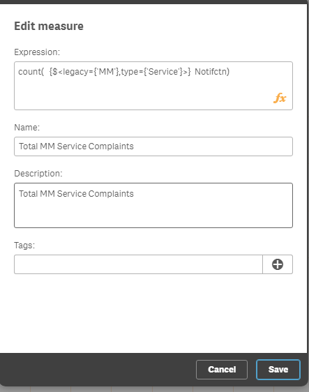
So in the end all I had to do was create 3 separate measures with the formulas:
count( {$<legacy={'ABC'},type={'Service'}>} Notifctn)
count( {$<legacy={'XYZ'},type={'Service'}>} Notifctn)
count( {$<type={'Service'}>} Notifctn)
Thanks
- Mark as New
- Bookmark
- Subscribe
- Mute
- Subscribe to RSS Feed
- Permalink
- Report Inappropriate Content
Hello,
I am not sure I understand how to do this, but I was able to solve the total summed line with a simpler solution below. Thanks for your time and feedback!
- Mark as New
- Bookmark
- Subscribe
- Mute
- Subscribe to RSS Feed
- Permalink
- Report Inappropriate Content
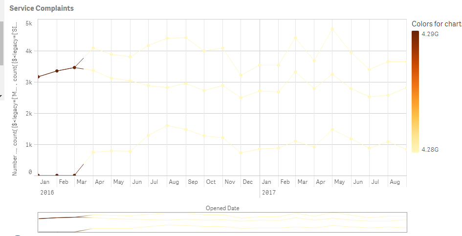
Thanks for the help again here, it seems after fixing my first problem (Now my chart has the 3 lines I wanted), the colors I applied before aren't even working now, so I am pretty lost. I tried adding this expression as a master measure and then adding it to my chart and it did not go quite as planned, and I don't see how I can change the label on my Y axis from the long unreadable name:
- Mark as New
- Bookmark
- Subscribe
- Mute
- Subscribe to RSS Feed
- Permalink
- Report Inappropriate Content
TIP:
If you have more than one measure on a line chart you cannot color each line using the default menu options.
Best work around for this is to create a master measure for your expressions as master measure have settable colors.
Create master measures with unique color
- Click to 'edit' top left
- Go to the master measure menu on the left hand side
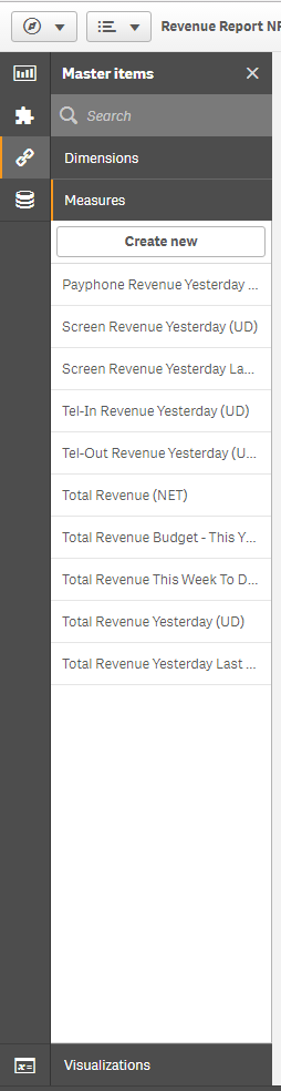
- Choose the chain icon (Master measures) - 'Measures' - 'Create new'
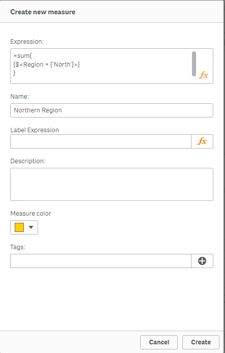
- A window pops up...
- Now add you first measure
- Add the sum etc or measure equation
- Name you measure
- Choose you color for the measure
- Click create
Tip:
You may need to use set analysis to limit the measure to show the measure you want.
- Repeat for all three measures...
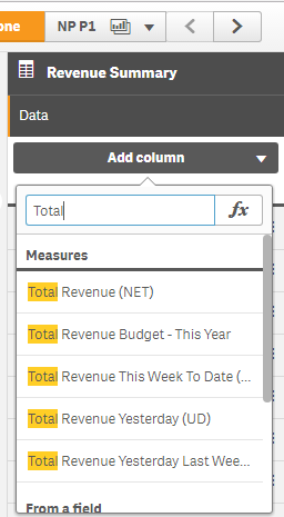
Add you master measures to the chart
- Select your chart
- On the chart menu on the right hand side
- Select 'Data' - 'Add column' - 'Measure'
- The measures you added to the master measures section they will now appear in the list of measures.
These measures now have your colors
- Mark as New
- Bookmark
- Subscribe
- Mute
- Subscribe to RSS Feed
- Permalink
- Report Inappropriate Content
Hello,
Thanks a lot. I removed all 3 measures from my chart, copied the formulas down, and recreated them as a master measure. In the end, this didn't change anything for me though unfortunately, as there is no option to pick any colors for me when creating a measure:
In the end, if it's this complicated to change the colors I may end up just leaving them as the defaults