Unlock a world of possibilities! Login now and discover the exclusive benefits awaiting you.
- Qlik Community
- :
- Forums
- :
- Analytics
- :
- New to Qlik Analytics
- :
- How to make scatter plot with date on X-axis and m...
- Subscribe to RSS Feed
- Mark Topic as New
- Mark Topic as Read
- Float this Topic for Current User
- Bookmark
- Subscribe
- Mute
- Printer Friendly Page
- Mark as New
- Bookmark
- Subscribe
- Mute
- Subscribe to RSS Feed
- Permalink
- Report Inappropriate Content
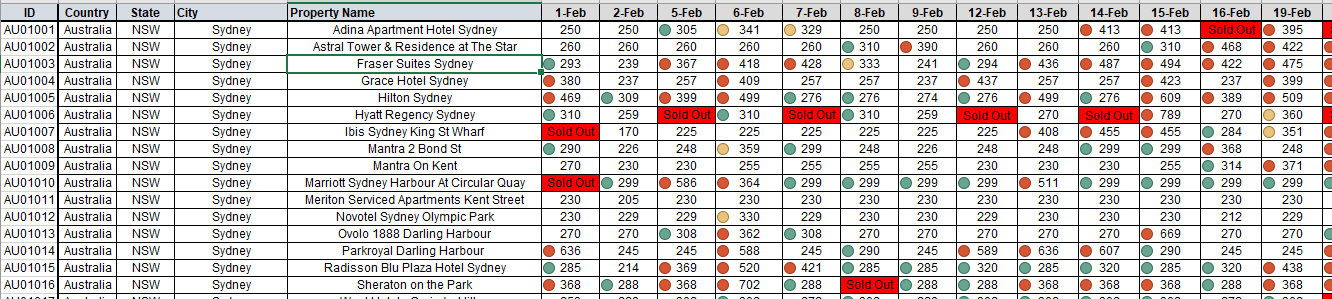
How to make scatter plot with date on X-axis and munber on Y-axis
raw data is telling the rate of hotels, it is keep updating everyday.
I want to make a scatter plot on every day's rates, which means X:date and Y:$rate.
Highly appriciate for taking time on my problem. Thank you all.
here is the screenshot and full data attached below. thank you.
- Mark as New
- Bookmark
- Subscribe
- Mute
- Subscribe to RSS Feed
- Permalink
- Report Inappropriate Content
Hi,
just found your question when looking for a related problem. I assume after more then a year it is either solved on no more relevant. But let me try to complete this thread:
1. What is the Dimension you want to represent a dot in your scatter? The plot will result in a distribution of many dots along a vertical line for each day on the time axis.
2. how do we solve a proper scaling of the time x-axis? This was my problem. I want the scaling to be e.g. one vertical line per month. But Sense simply distributes the x-axis labels evenly, resulting in maybe a line every 100 days...nonsense.
Any Idea to solve #2?