Unlock a world of possibilities! Login now and discover the exclusive benefits awaiting you.
- Qlik Community
- :
- Forums
- :
- Analytics
- :
- New to Qlik Analytics
- :
- How to show new charts after every drill down?
- Subscribe to RSS Feed
- Mark Topic as New
- Mark Topic as Read
- Float this Topic for Current User
- Bookmark
- Subscribe
- Mute
- Printer Friendly Page
- Mark as New
- Bookmark
- Subscribe
- Mute
- Subscribe to RSS Feed
- Permalink
- Report Inappropriate Content
How to show new charts after every drill down?
Hi,
I want to represent my data by different charts (pie, bar, column etc). Lets say, at the time of loading bar chart should come, and then after 1 level of drill down, I want to show pie chart (1st level column chart should be hidden here) as so on.
I am expecting below layout:
After every drill down, data representation should change.
Thanks
Dilip Solanki
Dilip Solanki
- « Previous Replies
-
- 1
- 2
- Next Replies »
Accepted Solutions
- Mark as New
- Bookmark
- Subscribe
- Mute
- Subscribe to RSS Feed
- Permalink
- Report Inappropriate Content
Ah ok; that should be easy to do:
1) create your 4 charts
2) in the first chart : under adds on, put condition here:
count(distinct Dimension1) = count(distinct ALL Dimension1)
3) in your 2nd chart, the condition would be :
count(distinct Dimension1) =1
4) in your 3rd chart, the condition would be :
count(distinct Dimension2) =1
4) in your 4th chart, the condition would be :
count(distinct Dimension3) =1
Example:

select dim1:
=>
but to do this, when u want to hide the first bar chart; u'll have to have the dimension of the pie: dim2
and to show the table; you'll have to select one value of dim2.
and so on
or u keep the first chart always shown, and do ur drill downs with ur drill down dimension
- Mark as New
- Bookmark
- Subscribe
- Mute
- Subscribe to RSS Feed
- Permalink
- Report Inappropriate Content
Hi,
you should take a look at the extensions to do this... conditional charts display is not yet available
- Mark as New
- Bookmark
- Subscribe
- Mute
- Subscribe to RSS Feed
- Permalink
- Report Inappropriate Content
Some time ago I used this extension ShowHide Container from Qlik Branch and it works great.
- Mark as New
- Bookmark
- Subscribe
- Mute
- Subscribe to RSS Feed
- Permalink
- Report Inappropriate Content
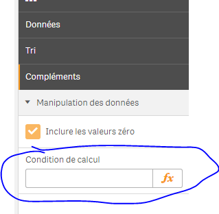
to achieve what you are saying you can use calculation condition under Add-ons->Data handling.
- Mark as New
- Bookmark
- Subscribe
- Mute
- Subscribe to RSS Feed
- Permalink
- Report Inappropriate Content
Oh hell no ! that would be perfect !
He wants to be able to change the representation of the SAME chart..
- Mark as New
- Bookmark
- Subscribe
- Mute
- Subscribe to RSS Feed
- Permalink
- Report Inappropriate Content
Omar,
I do not wants to change the same chart representation, what I am expecting is like in dashboard we have 4 different objects on dashboard, bar charts, pie charts, data table and KIV.
Please have a look below:
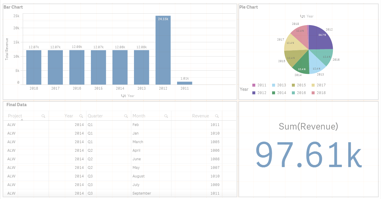
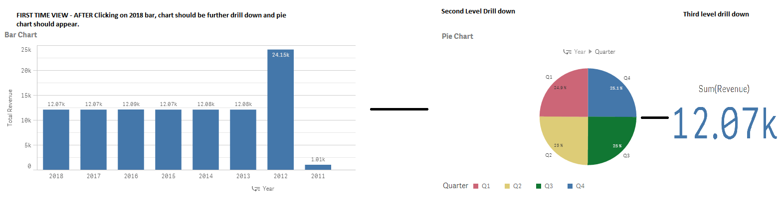
In above SS, we have 4 objects, what I want is, I want to hide pie chart, data table and KIV in initial view. Only Bar charts will be visible at first glance.
On first level drill down, Bar charts will be hide and Pie charts will be shown. Then in second level drill down, Data table will be appeared and pie chart will be hidden. as so on.
So I am trying to find that is there any thing in Qlik sense where we can show and hide objects basis on filter.
Thanks
Dilip Solanki
Dilip Solanki
- Mark as New
- Bookmark
- Subscribe
- Mute
- Subscribe to RSS Feed
- Permalink
- Report Inappropriate Content
Understood.. unfortunately you will have to take a look at extensions.. you can't do it out of the box
- Mark as New
- Bookmark
- Subscribe
- Mute
- Subscribe to RSS Feed
- Permalink
- Report Inappropriate Content
With the calculation condition under Add-ons->Data handling Andrea suggested you can get a chart to display a simple message instead of visualising dependant on the result of a condition.
- Mark as New
- Bookmark
- Subscribe
- Mute
- Subscribe to RSS Feed
- Permalink
- Report Inappropriate Content
Ah ok; that should be easy to do:
1) create your 4 charts
2) in the first chart : under adds on, put condition here:
count(distinct Dimension1) = count(distinct ALL Dimension1)
3) in your 2nd chart, the condition would be :
count(distinct Dimension1) =1
4) in your 3rd chart, the condition would be :
count(distinct Dimension2) =1
4) in your 4th chart, the condition would be :
count(distinct Dimension3) =1
Example:
select dim1:
=>
but to do this, when u want to hide the first bar chart; u'll have to have the dimension of the pie: dim2
and to show the table; you'll have to select one value of dim2.
and so on
or u keep the first chart always shown, and do ur drill downs with ur drill down dimension
- Mark as New
- Bookmark
- Subscribe
- Mute
- Subscribe to RSS Feed
- Permalink
- Report Inappropriate Content
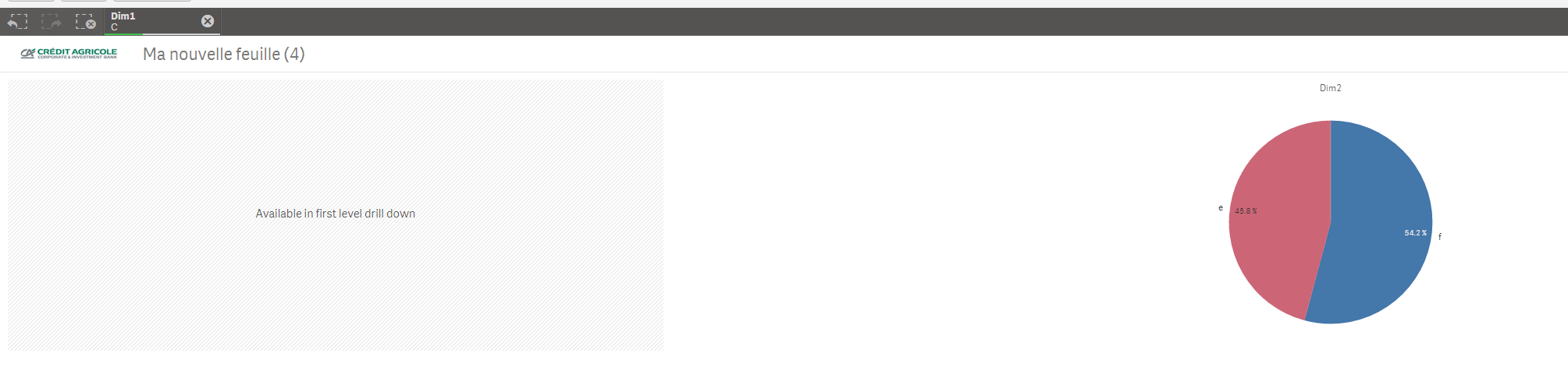
Thanks Omar. Its working.
Only thing remaining is, if condition not matched then below block is appearing. Can we hide this as well?
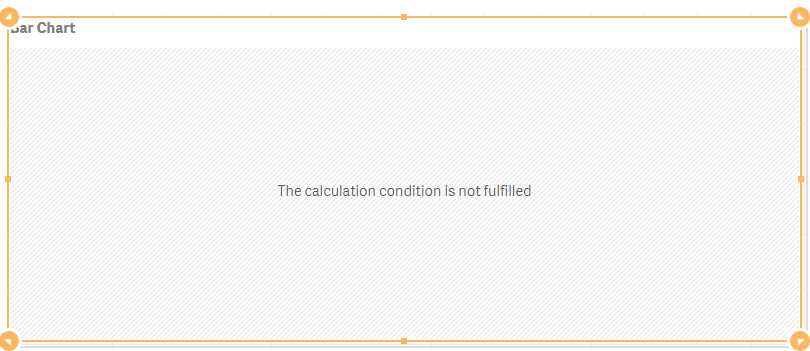
I think it could be hidden through mashups. But I want to avoid using mashups.
Thanks
Dilip Solanki
Dilip Solanki
- « Previous Replies
-
- 1
- 2
- Next Replies »