Unlock a world of possibilities! Login now and discover the exclusive benefits awaiting you.
- Qlik Community
- :
- Forums
- :
- Analytics
- :
- App Development
- :
- Re: Add % to label in Expression Editor
- Subscribe to RSS Feed
- Mark Topic as New
- Mark Topic as Read
- Float this Topic for Current User
- Bookmark
- Subscribe
- Mute
- Printer Friendly Page
- Mark as New
- Bookmark
- Subscribe
- Mute
- Subscribe to RSS Feed
- Permalink
- Report Inappropriate Content
Add % to label in Expression Editor
Hi,
I'm trying to format a calculation as a percentage in the Colors and Legend: By Measure: Expression Editor section of a Map chart. Can someone tell me if that is possible and if so, how to go about doing it? The basic formula is as follows:
count(distinct([Acct]))/sum(TotalEEs)
Thanks,
Bryan
- « Previous Replies
-
- 1
- 2
- Next Replies »
- Mark as New
- Bookmark
- Subscribe
- Mute
- Subscribe to RSS Feed
- Permalink
- Report Inappropriate Content
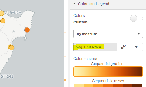
If you create a master measure (Say MyMeasure) first and then select it in the Map property --> Appearance --> Colors and Legend --> Colors (Custom) --> By Measure --> MyMeasure
Will that work for you?
- Mark as New
- Bookmark
- Subscribe
- Mute
- Subscribe to RSS Feed
- Permalink
- Report Inappropriate Content
I don't think you need to format the expression which you are using for color.
Still you can try num(count(distinct([Acct]))/sum(TotalEEs),'#,##0.00%').
- Mark as New
- Bookmark
- Subscribe
- Mute
- Subscribe to RSS Feed
- Permalink
- Report Inappropriate Content
Hi, Shraddha,
I tried the code you suggested but it didn't produce any changes to the format of the numbers. Any other suggestions?
Thanks,
Bryan
- Mark as New
- Bookmark
- Subscribe
- Mute
- Subscribe to RSS Feed
- Permalink
- Report Inappropriate Content
It wont make any change in format because you are applying it for color expression.
If you want to change the format of number which are displayed on pop up(hover on points) then you will have to use num() in expression used in Measure section of chart.
- Mark as New
- Bookmark
- Subscribe
- Mute
- Subscribe to RSS Feed
- Permalink
- Report Inappropriate Content
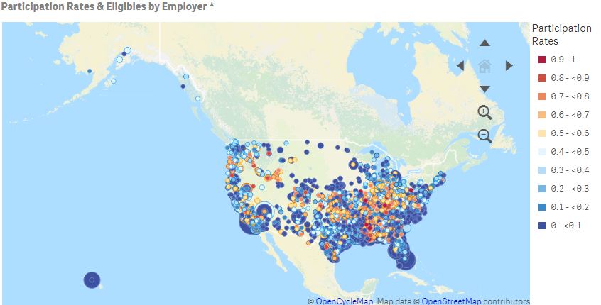
What I'm trying to display is a combination of two measures. I am using a Point Layer on the Map chart.
The bubble size is based on the number of employees in a group. The Appearance of the bubbles is set in Colors and Legend: Custom, By Measure where the color is chosen based on the result of a calculation of unique customers out of total employees in a group, written as this in the Expression Editor: count(distinct([Acct]))/sum(TotalEEs). We want this number to be expressed as a percentage.
I've tried a number of variations of num(count(distinct([Acct]))/sum(TotalEEs),'#,##0.00%') in the formula, but none of them have an effect on the display of the calculation. Can you think of a way to make this happen, or am I basically out of luck?
Thanks again,
Bryan
- Mark as New
- Bookmark
- Subscribe
- Mute
- Subscribe to RSS Feed
- Permalink
- Report Inappropriate Content
Formatting the expression which is used for color or bubble size wont make any differece.
If possible provide a sample app..
- Mark as New
- Bookmark
- Subscribe
- Mute
- Subscribe to RSS Feed
- Permalink
- Report Inappropriate Content
Perhaps this will help. I'm not sure how I would go about providing a sample app of this data.
- Mark as New
- Bookmark
- Subscribe
- Mute
- Subscribe to RSS Feed
- Permalink
- Report Inappropriate Content
When you hover on bubbles what does it show?
Do you expect % sign there?
- Mark as New
- Bookmark
- Subscribe
- Mute
- Subscribe to RSS Feed
- Permalink
- Report Inappropriate Content
It shows the number of employees in the group and a number like 0.15 instead of 15%, which is what we'd prefer to see. Same for the legend--would prefer the numbers be expressed as percentages and not unformated numbers.
- « Previous Replies
-
- 1
- 2
- Next Replies »