Unlock a world of possibilities! Login now and discover the exclusive benefits awaiting you.
- Qlik Community
- :
- Forums
- :
- Analytics
- :
- App Development
- :
- Re: Cumulative Line Chart
- Subscribe to RSS Feed
- Mark Topic as New
- Mark Topic as Read
- Float this Topic for Current User
- Bookmark
- Subscribe
- Mute
- Printer Friendly Page
- Mark as New
- Bookmark
- Subscribe
- Mute
- Subscribe to RSS Feed
- Permalink
- Report Inappropriate Content
Cumulative Line Chart
Hello Guys,
I need to plot Number of Hours vs No months In a Line chart . I wanted to show a nice cumulative curve .Could you please help me with this . My sample data is shown as below though there are lot of values I am just showing few .
| Hours | Months |
|---|---|
| 200 | 1 |
| 600 | 2 |
| 1000 | 3 |
| 1500 | 4 |
My months expression is :- (If(( Flow='3'),Round((((( fabs(If (''LOI''<0,(''LOI''))*Hours)/Days)))/730.0008),0.01),Null() ))
My months expression works fine .
SO kindly help me how do I plot cumulative line chart.
Thanks,
ravi
- Mark as New
- Bookmark
- Subscribe
- Mute
- Subscribe to RSS Feed
- Permalink
- Report Inappropriate Content
Hi Ravi,
What you want to achieve you could do with RangeSum.
I've made a A simple sample app with your data with the following expression:
rangesum(above( sum(REVENUE), 0, rowno() ))
wich gives the cumulative \aspect your searching for.
Attached the app I made, hope it helps.
Felipe.
- Mark as New
- Bookmark
- Subscribe
- Mute
- Subscribe to RSS Feed
- Permalink
- Report Inappropriate Content
Hello Felipe,
Thanks a lot for replying !
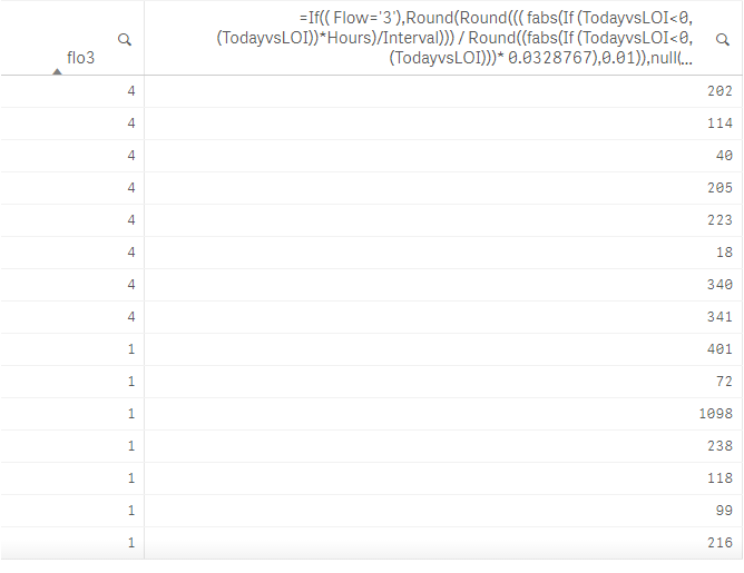
Yes it worked to some extent .
Now I have data something like this as show below in the image where you can see there are multiple
Flow Number 4 and 1 and which has multiple values assigned. So in this case I am not able to get curve . So how do I handle this ?
Flow3 field is my dimension
and the big expression is my Measure .
Kindly help me with this .....