Unlock a world of possibilities! Login now and discover the exclusive benefits awaiting you.
- Qlik Community
- :
- Forums
- :
- Analytics
- :
- App Development
- :
- Line Chart with Color Condition (Variance TYvsLY)
- Subscribe to RSS Feed
- Mark Topic as New
- Mark Topic as Read
- Float this Topic for Current User
- Bookmark
- Subscribe
- Mute
- Printer Friendly Page
- Mark as New
- Bookmark
- Subscribe
- Mute
- Subscribe to RSS Feed
- Permalink
- Report Inappropriate Content
Line Chart with Color Condition (Variance TYvsLY)
Hi,
How can I create this line chart here?
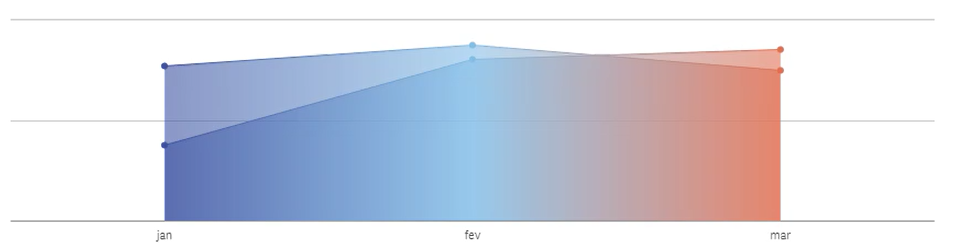
just explaining a bit more, this is a sales comparsion between Actual Year and Last Year (just months "Jan,Feb,Mar" for both years)
the color in the area shows the variance TY vs LY, when the variance is negative it shows a red tone and if is positive it shows blue tone
This is the color expression that I was trying to do but it not worked
colormix2(
(
Sum({$<Year={'$(=max(Year))'}>}quantity*price_unit)
/
Sum({$<Year={'$(=max(Year)-1)'}>}quantity*price_unit)
)
-1
,
red(), // minus one color
white(), // 0 color
blue() // plus one color
)
ps: I am already using the Qlik Sense 3.1, this release looks like better to work with color conditions